BetterUI Challenge: Hey Smashing Magazine Can You Try & Test No Coupon Fields?

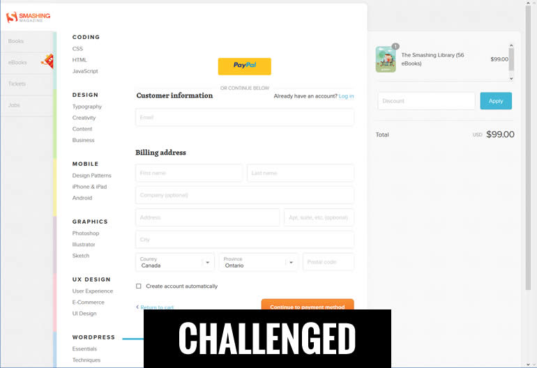
Smashingmagazine.com has a nice checkout - but it could be better. Although there are probably quite a few things that could be improved on there, today I just wanted to challenge their little coupon field. I am predicting that the No Coupon Field pattern that zaps all coupon and discount fields is highly applicable and would generate additional sales.
Here Is What We Need From You:
- Sep 30, 2017 Update: Since Smashing Mag is not interested in this experiment, we're extending it to anyone with a discount field on a checkout page. :) If you have a coupon field on your checkout, are willing to test it and sharing the results here, we will help you with the test setup! Email me (jakub at linowski . ca if you need a hand).
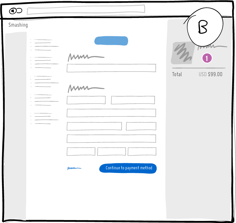
Look at our top variation B (shown below) and for each UI improvement that you think will drive more sales, share it as a comment.Multiple comments are fine but keep each comment tied to 1 idea for easier prioritizationVote on your own or other people's ideas and let's try to surface the best ones to the top
Variation B: Our Challenger Concept
Here is one of our very simple concepts for smashingmagazine.com to a/b test which contains the No Coupon Field pattern as the key change.

- No Coupon Fields
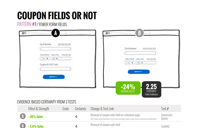
There is not much to this pattern other than removing the discount field completely that might send people to a search engine for a discount code - only to get lost in the process. :)
How Do I Know It Will Win?
It's not me, it's the pattern. Although I am never 100% certain, I am very confident on this one because I have observed 3 past a/b tests with similar changes in Datastories Pattern #1. We have gathered 3 positive out of 3 tests with a median +24% effect (I really doubt it will be that high). So that's what we're using to predict this. Here is a sample:

Outcomes & Updates
-
Sep 30, 2017 - Smashing Is Not Interested In Testing
I reached out to @smashingmag about this challenge and they confirmed they won't test it even though they suspect "something fishy" in their checkout:
It’s a conscious decision, also based on some tests. There is something fishy in there — by design ;-)
— Smashing Magazine (@smashingmag) October 1, 2017
There is something else that goes into UX for us, rather than conversion at the end of the day. :-)
— Smashing Magazine (@smashingmag) October 2, 2017
Ultimately, it's my fault for not convincing Smashing Magazine. Every business owner also has a right and obligation to make decisions on how they roll. It's just too bad that the reason for not testing is some fuzzy and mysterious reference to UX (as if hiding behind UX is something bigger than running an experiment). Meanwhile there are plenty of qualitative studies pointing at negative feelings of unfairness as a result of prompting with coupon fields. The frustration of encountering coupon fields has also been explained by others. And then we also have 3 tests of our own in favor of the change. With all the evidence for the experiment, is this human irrationality becoming visible? Or perhaps running tests like these in the open takes courage and I might be asking for too much with these tweet based challenges. :) But before we give up, here is something else ...
-
Oct 1, 2017 - We're Extending This Challenge To Anyone With A Coupon Field :)
I am not taking no for an answer. If you have a checkout page + a coupon field + willingness to learn from experiments, email to me and we will help you setup the test.
Comments
AdamG 8 years ago ↑1↓1
That looks like a Shopify checkout, so depending on their plan and abilities, they may not be ABLE to tinker with it too much.
Reply
David 8 years ago ↑4↓1
I’m not going to say who I work for but we recently made the change to make the “coupon code” area less visible. We didnt remove it completely because the user needs a place to drop in available coupon codes. We are seeing less conversion vs the control but we are also seeing a large increase RPV. We believe with the coupon code area being less visible the customers that really want the product will pay for it.
Reply
Valentin 8 years ago ↑1↓1
Hm. Are you not seeing the elephant in the room?
If custom discounts represent a serious marketing channel for the business how can purchase page without discount field meet the need to provide a way to purchase with discounts?
Puzzling suggestion, you can improve chances for success if you provide a clear path for discounted sales.
Reply
Jakub Linowski 8 years ago ↑1↓1
The base concept simply removes the discount code. Alternative variations could show the discount code in more creative ways (less visible, or automatically applied with custom urls only for the people that it applies to). :)
Reply