A Simple Way To Increase Scroll Rate

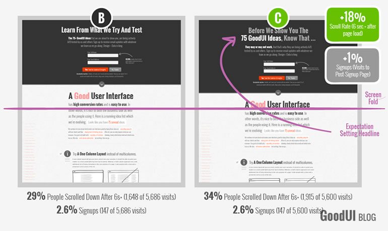
As we recently tested alternatives to the popup modal, we discovered a simple way of inviting more people to scroll on a page. We were able to extract this insight by comparing two variations, one of which had an expectation setting headline that started with the words "Before We Show You ...". This slight change seemed to cause a +18% increase in the amount of people that scrolled downwards.
Interestingly, the signup rates (primary metric of the test) for both B and C were pretty much the same. Hence, the extra scrolling rate did not somehow move people's attention away from actually signing up. This was an important indication that the email capture pattern with the preceding text could let us have the best of both worlds. With the expectation setting text, more people would scroll to discover the content underneath while still signing up to the mailing list at a similar rate. Of course, we should also add that both variations had further email capture cues in the middle and bottom of the long page for those people that did actually scroll.
Although we might often argue that the scroll rate is a shallow metric (far from deeper business goals like sales and revenue), it still may be useful in some cases as a way to ensure that visitors do not get stuck at a false bottom and proceed to explore the rest of the page.
Comments