Airbnb A/B Tested And Dropped Its Videos On The Host Signup Page
Videos are usually considered a popular growth tactic that people believe will improve conversion or signup rates. Hence I find it really interesting that Airbnb A/B tested a series of videos on their host signup landing page and then rejected them altogether. So why where these video removed?


C - Jun 10, 2019 Screenshot

Highlighted UI Changes From This Leak
-
The Tested Videos
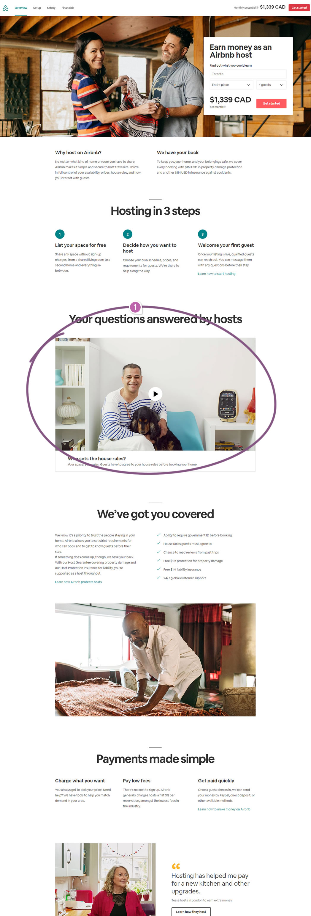
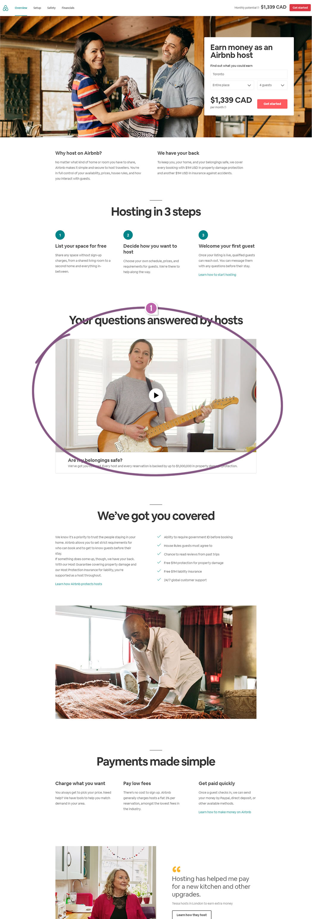
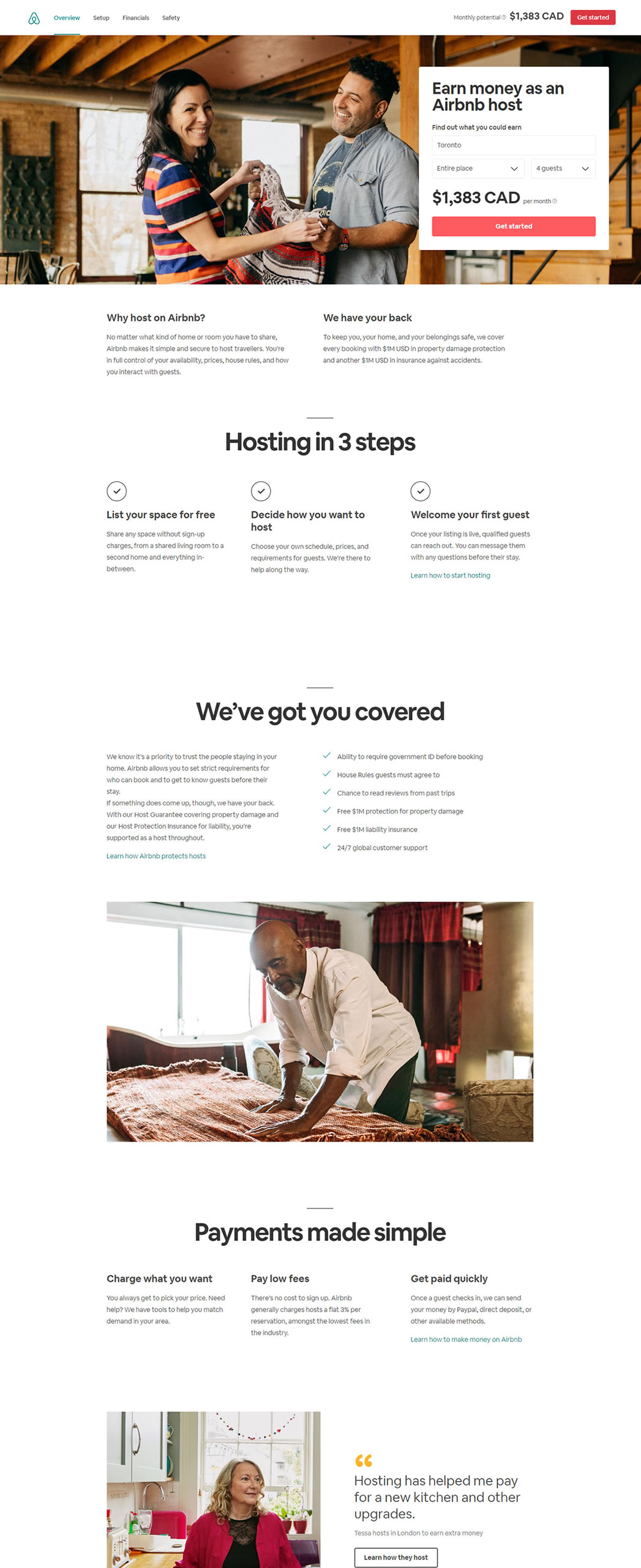
It's quite clear that there was an active experiment which explored a series of high quality videos such as this one, this one and this one. The test setup also contained a variant without the videos as well, but with an additional testimonial in their place.
Most of the videos had a theme of placing the host as being in control which seems like a positive reassurance. The videos made it super clear that the hosts set the house rules, and can choose when to make their listing available for rent.
One thing which I though was a little surprising however was that each video showed various people even though the default video image would only show a single one. Sometimes the people in the snapshot and the video weren't the first ones to be shown when played. Could this subtle inconsistency of actors have anything to do with the test outcome? Not sure.
Or perhaps it's simply more effective to show a summary of reassurances (like the "We've got you covered" section) rather than raising a single question at a time. Perhaps bulleted summaries are quicker to scan and quicker to find the relevant answers than having to watch a 40 second video?
These of course are just retrospective guesses. Do you have any thoughts as to why possibly these videos didn't make the cut?


Comments
Nathaniel Platts 6 years ago ↑0↓0
From my research, the majority of people scan content (often in an "F" pattern). From personal observation and my own habits as well, videos sometimes show a defining factor that seals the deal. For instance, when I was comparing different usability services (Hotjar, usertesting, usabilityhub) for collecting user feedback and analytics, one particular video solidified my decision. Essentially, there were a lot of websites pretty much with the same offering. But one video in particular captured my attention by 1. Who was endorsing the product 2. How they were using it 3. How it made their product better. The data I scanned was impressive, the website was very easy to scan, crazy super simple but well crafted and aesthetically pleasing. In fact, I would say that because the landing page was so simple and quick to scan, I wanted to watch the video even more.
Reply
Noemi Rozpara 6 years ago ↑1↓0
I usually don't play videos on websites at all (this also applies to social media etc), I believe you can find required informations quicker in the text (your eye sees keywords, which can't be achieved in the video).
Also the video of the place owner feels too persuasive for me (like "look at me, I'm soooo trustworthy"). I would feel much more safe if I saw other's testimonials instead.
Reply