Airbnb Discovers A Better Calendar Picker Component From This UI Experiment
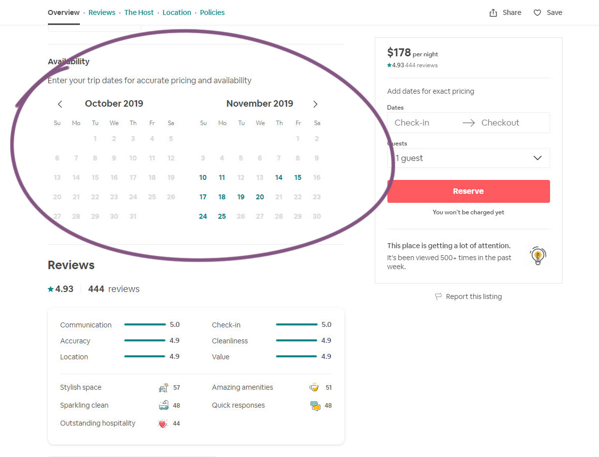
This was a simple calendar picker experiment that Aribnb recently ran and eventually rolled out. The A/B test contains at least 4 simple UI changes which might have contributed to a positive outcome. And so this also shows us what a slightly better UI component looks like.

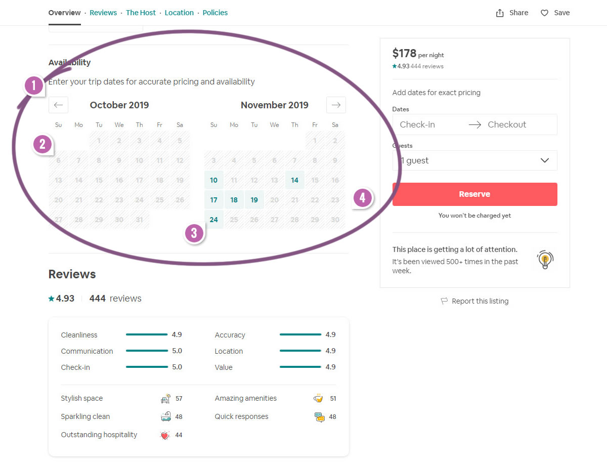
B - Oct 31, 2019 Screenshot

Highlighted UI Changes From This Leak
-
Bordered Month Slider Buttons
One visible change is of the arrow icons gaining more of a defined border, making them more of a button style.
This is very similar to Pattern #116: Links Or Buttons
-
Disabled Background Fill For Unavailable Dates
Secondly, we also see that the B variation had a greyish background fill on the dates that were not available. Interestingly, the disabled style also used a hatched texture as an additional cue to further differentiate the style.
-
Green Background Fill For Available Dates
Similarly, the available dates gained a stronger green background fill for the available dates. Perhaps these two styles made it a little more easier to compare and see which dates were available and which weren't.
This is very similar to Pattern #107: Contrast Links & Buttons
-
Wider Component
Finally, notice how the component in version B is a little wider by filling the full column. The date buttons are therefore slightly bigger, or perhaps have a bit more padding.
This is very similar to Pattern #97: Bigger Form Fields


Comments