Amazon's Loaded Hamburger Menu Beats Its Older Dropdown Version In This A/B Test
At first glance some A/B tests may seem like they are beautifully simple with a single controlled variable. Yet as we look at the experiment in more detail, more and more subtle differences start coming into view. This I think is the case with Amazon's most recent experiment where it seems that only a dropdown menu was shifted into a hamburger one - which ended up winning.

B - Sep 16, 2019 Screenshot

Highlighted UI Changes From This Leak
-
Dropdown Vs Hamburger Menu
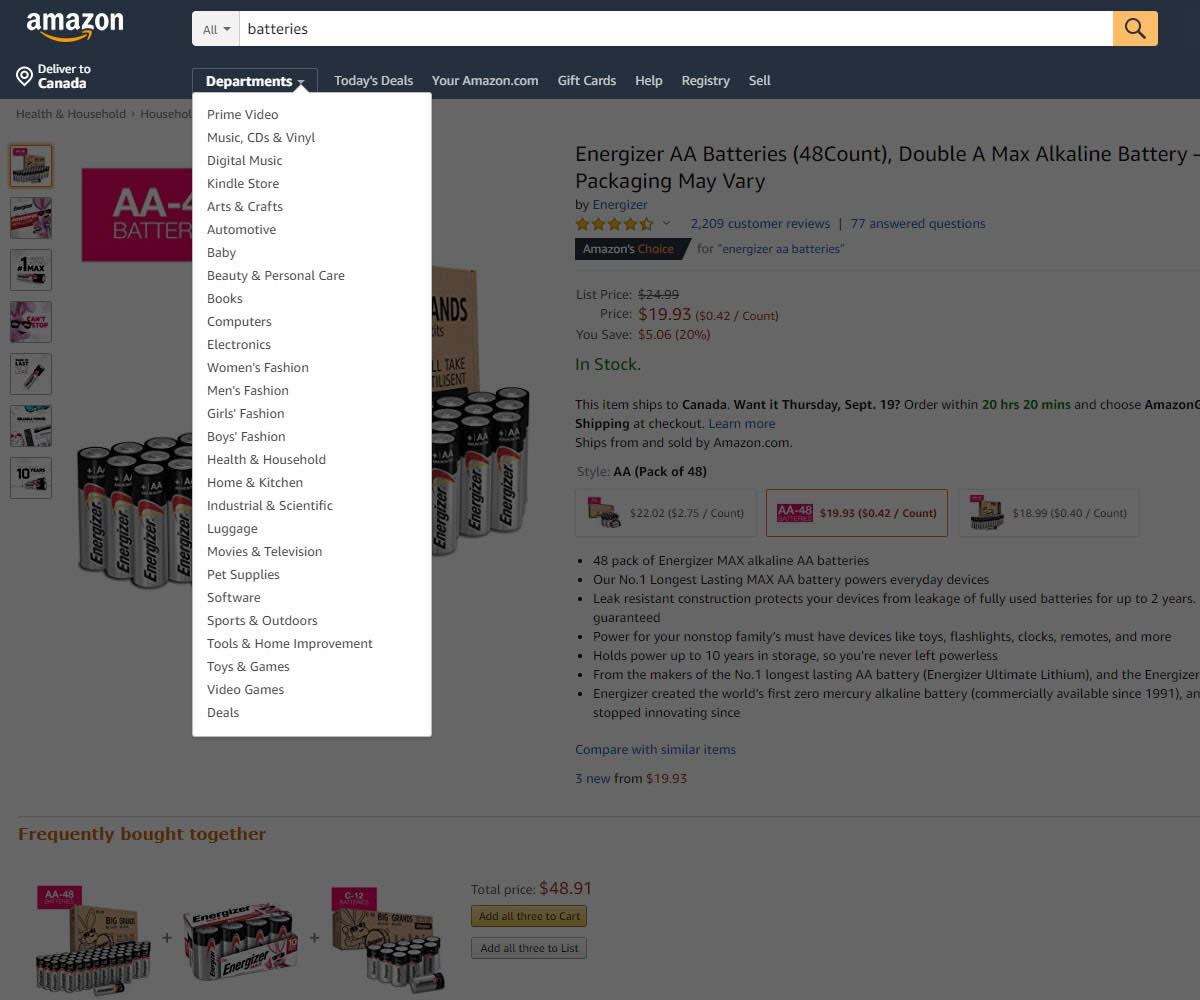
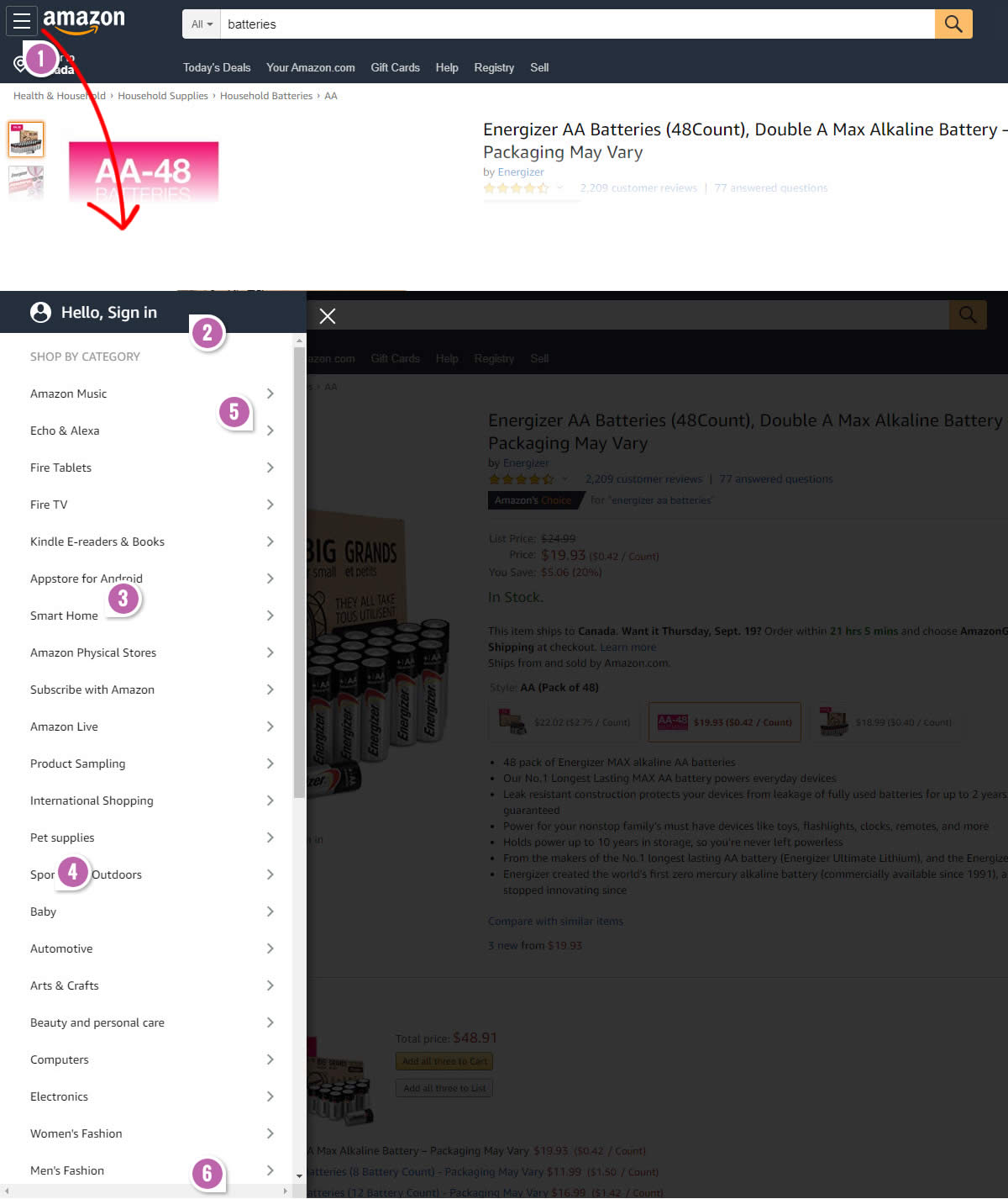
One of the first visible changes in this experiment was the shift of the broad "Department" menu from the navigation (A), towards the upper left into a "Hamburger" menu. Yes, this also means that the "Department" label disappeared and was replaced with an icon (B).
This is very similar to Pattern #2: Icon Labels
-
A More Prominent Sign-In Option
Interestingly, the experiment wasn't a simple menu shift as after clicking the hamburger icon, users would see a very strong call to sign-in as the first option. This of course wasn't visible in the control. I would guess that encourgaing users to signin, allows Amazon to surface more relevant products and makes for an overall better experience.
-
More Options
The B variation menu was longer and contained more options. As a result of this a scrollbar was also added.
-
More Padding
Perhaps subtle, but you might notice that the B variation menu has more padding between menu option. More padding of course is known to make selections to be performed more easily - especially when using fingers.
-
Multi-Level Options
Another difference between the control (A) and the variation (B) that ended up winning, was that most options contained a second level. Clicking on "Echo & Alexa" for example would bring up another level of options specific to that selection.
-
Full Height
And last but not least, the B variant menu also took up the full 100% height of the screen.


Comments
Vatsal 5 years ago ↑1↓0
Hamburger menus have seen their ups and downs in terms of adoption. This experiment is a good example of going against the established "if it is not in view it is not in their minds" and all the advocacy against using hamburger menu.
This makes a very good case study for testing our designs before rejecting them because they are not following certain rules.
Reply