Netflix A/B Tests A Single Plan Recommendation And It Becomes Rejected
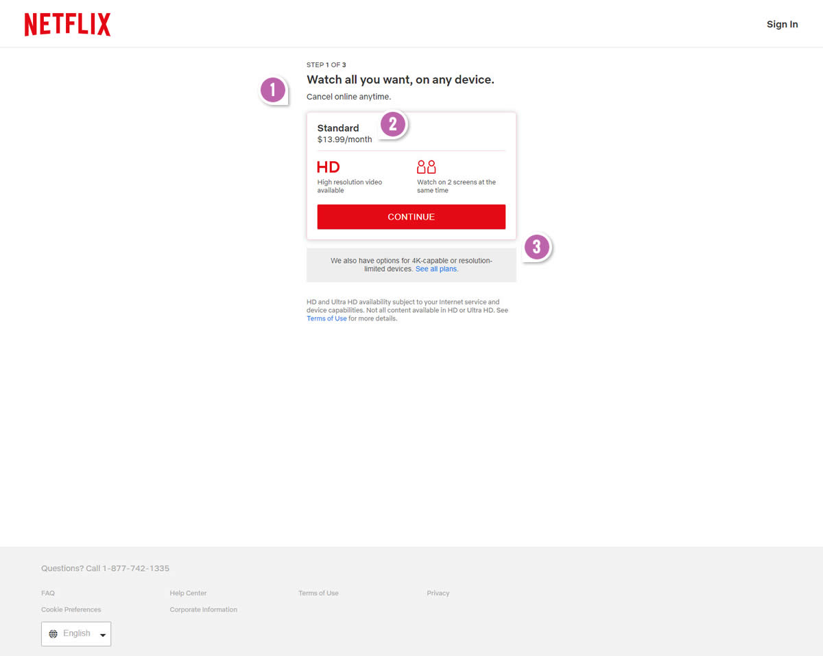
Netflix made a bold move and challenged their traditional 3 plan pricing page with a preselected single plan recommendation. Clear and equally balanced choice vs. a single mid tier plan. Fastforward another few weeks and it looks like the experiment completed with the traditional 3 plan keeping its place (they are running some other tests there actually which we're hoping to report on in the future). :)

B - Nov 18, 2019 Screenshot

Highlighted UI Changes From This Leak
-
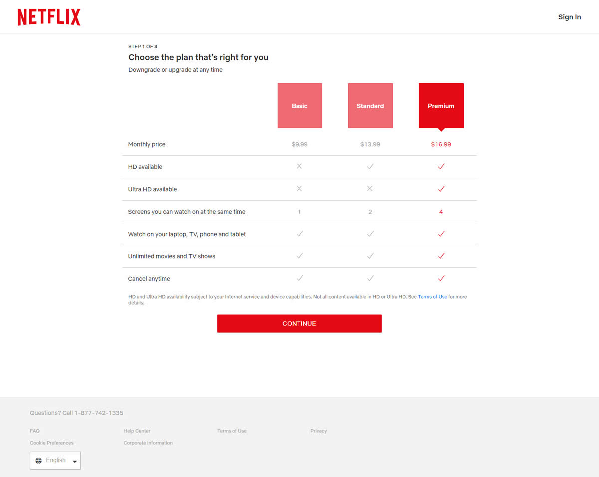
Three Plan Comparison Vs Single Plan Recommendation
In the control version (A) we see a unifrom distribution of 3 plans ranging from the least to the most expensive one. This layout also allows for a plan comparison using feature checkmarks - clearly giving more weight to the most expensive plan on the right.
-0.5 Repeatability has been assigned to Pattern #113: More Or Fewer Plans as evidence that it's getting worse
Repeatability is a net count of evidence for or against a pattern. It’s how we can predict which patterns are better than others. :)
-
Most Expensive Vs Mid Expensive Plan Default
You might also have noticed that in the control version (A), the recommended plan was defaulted to the most expensive one (Premium). In the variant (B) it was set to the mid tier plan (Standard). From past experiments we know that such a change is most likely a trade-off pattern with opposing effects between sales and revenue (members get access to see by how much).
This is very similar to Pattern #17: Expensive First
-
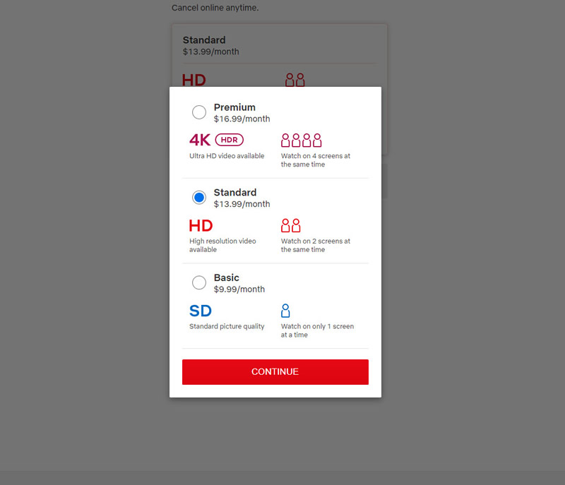
Modal Option To Select Any Of The Three Plans
Finally, we should also add that the variation (B) only symbolically pushed a single plan recommendation. The UI also allowed a plan selection by clicking the secondary and less visible "See all plans" link that launched a modal popup.

Modal With All Plans


Comments