Netflix Finally Succeeds With These 3 Tested Home Page Patterns
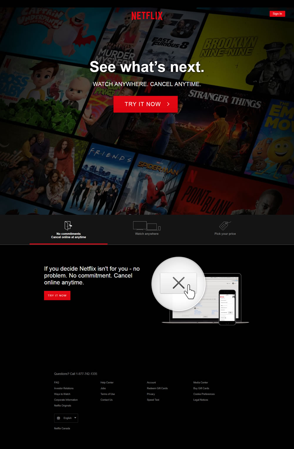
If you might recall, some of the recent Netflix homepage experiments weren't so positive as seen here and here. Today however we finally detected what might be considered a successful roll out decision of one variation tested over a month ago. Gladly Netflix doesn't give up. Here are the 3 core changes which we think might have influenced a positive outcome.

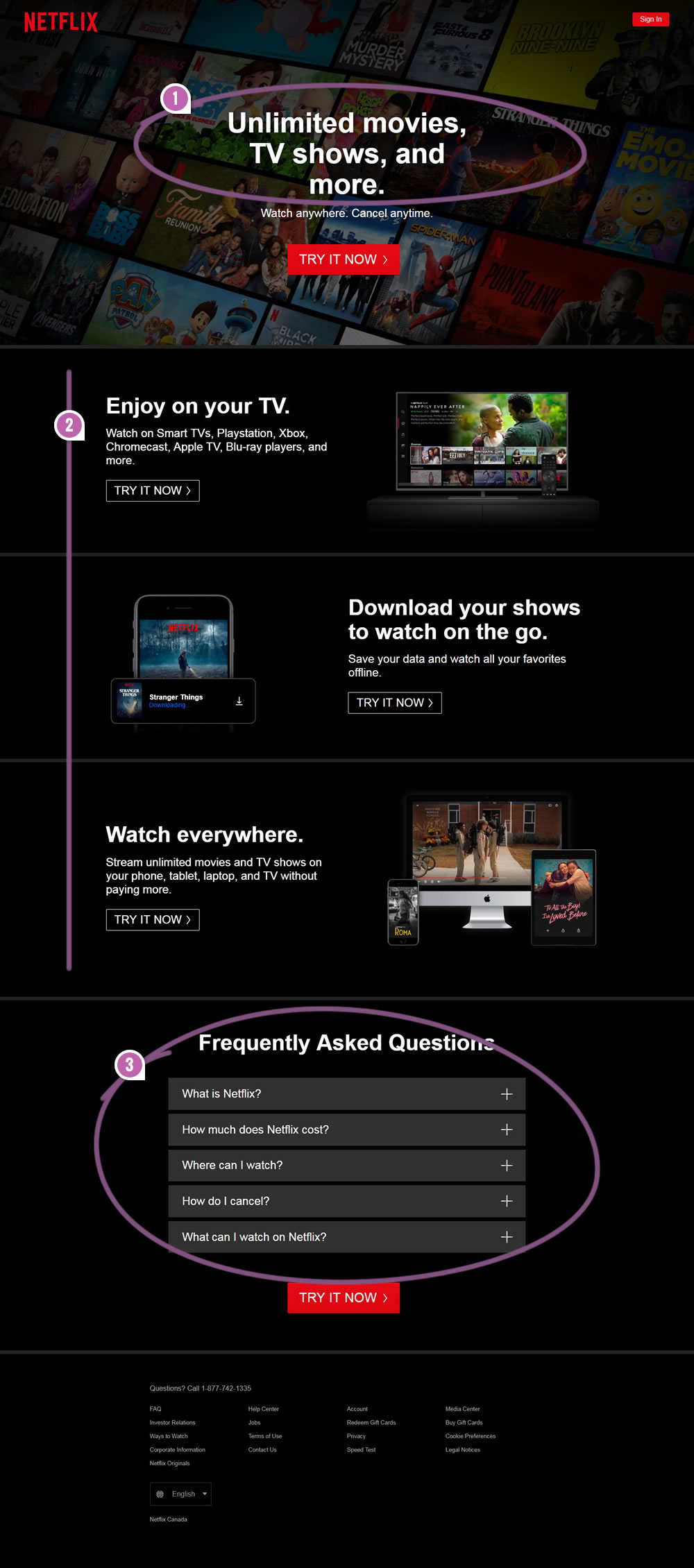
B - Jul 22, 2019 Screenshot

Highlighted UI Changes From This Leak
-
Headline: Unlimited Movies, TV Shows & More
This headline uses a powerful keyword (unlimited) as well as clarifies the type of content (movies, tv shows, etc.) that can be watched.
-
Reassuring Use Cases
Three sections have been injected in the middle of the page highlighting how Netflix can be used (on a wide range of TV setups, pre-downloaded for mobile, and everywhere else for unlimited watching without the price ever increasing). Each section also has a repeated call to action.
At a higher level of abstraction, notice how ultra consistent all of these 3 sections are with the top headline. They are essentially saying the same thing in a more elaborate way. Even the repeated calls to action ("Try it now") are just reinforicing the same signal. Such consitency might be a key property to consider for building out the copy of any landing page.
This is very similar to Pattern #33: Example Situations
-
Frequently Asked Questions
And one of course, a FAQ section has been added to answer additional and popular questions (including ones that are further repeating the same information about where can Netflix be watches, as well as pricing and cancellation quesitons).
This is very similar to Pattern #108: Frequently Asked Questions
One More Insight About Billing Graphs
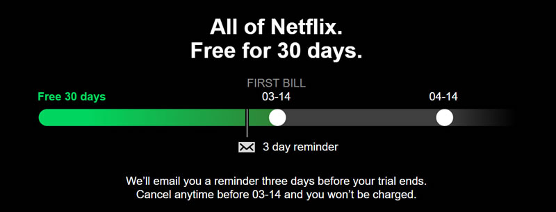
We might be able to infer one more thing from this successful variation if we compare it to the ultra similar B variation tested in February 2019. Notice how the only difference between the previously rejected variation and the successful one here is that the rejected one had a visible billing graph like the following:

Based on this subtle comparison, we could hypothesize that showing billing graphs (with the full spectrum of future payments) probably isn't a good idea. This of course is inline with the recently leaked Airbnb experiment as well. A subtle replication of sorts ...


Comments