Zalando Rejects Black Add-To-Cart Buttons
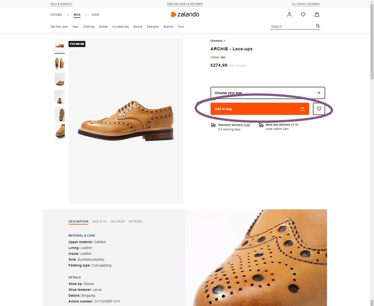
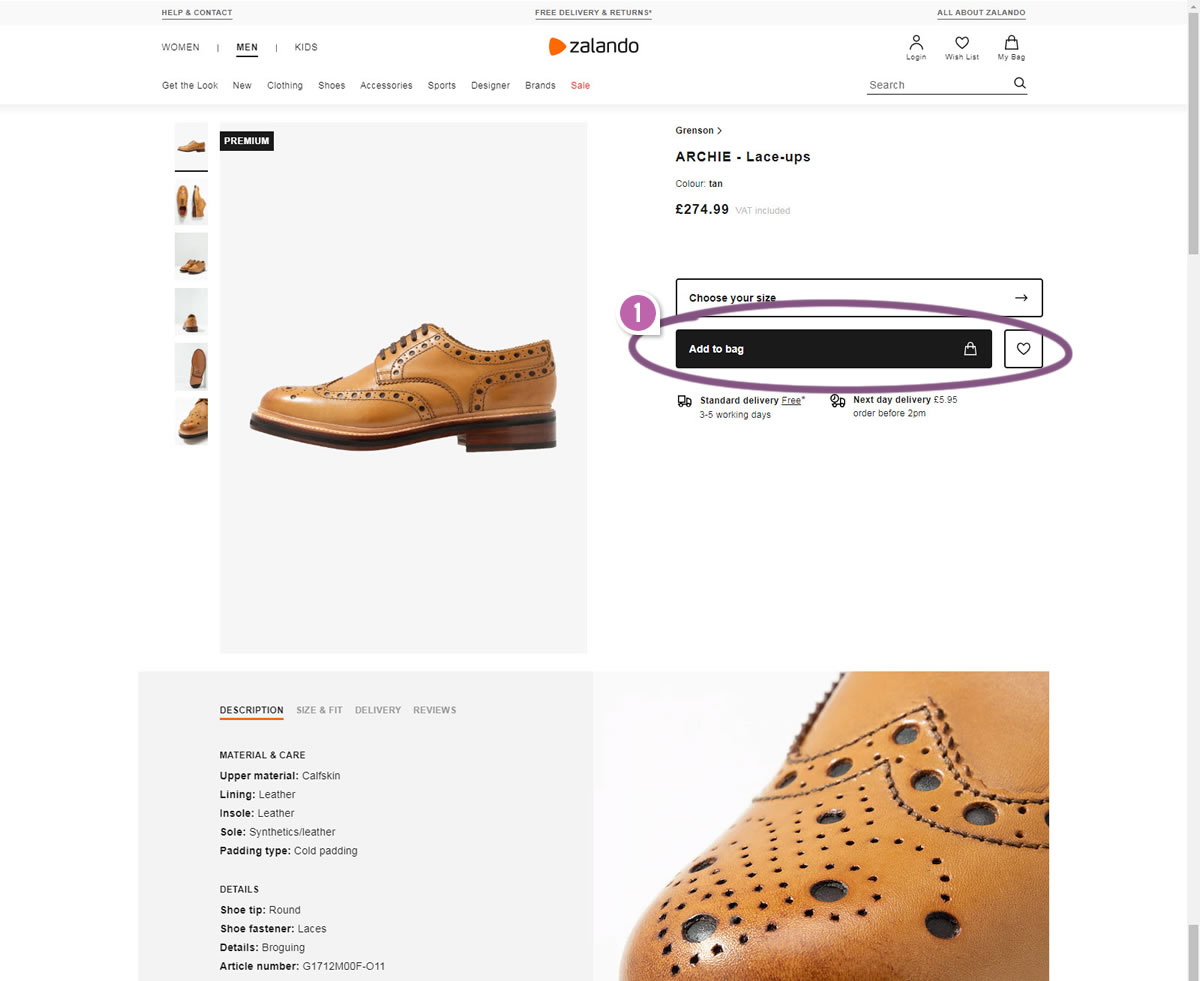
Zalando has run a simple experiment on their product page where they challenged their existing orange add-to-cart button against a black one. One month later, the black button was rejected even though the black one had a higher contrast ratio.

B - Sep 19, 2019 Screenshot

Highlighted UI Changes From This Leak
-
Darker Button
The B variation had a black add-to-cart button with a higher contrast ratio of 17.4 instead of the orange one with a contrast ratio of only 3.3. I find this interesting that the higher contrast black was rejected. This might suggest that button contrast alone isn't what influences visibility (and perhaps a more optimal conversion rate?).
If we look at the use of black throughout the screen, we might observe there are plenty of other black elements which might have diluted the color's meaning (ex: the black premium tag, and the main black copy). Perhaps then it's also important to reserve a unique color for actionable buttons which maybe the orange achieves.
-0.5 Repeatability has been assigned to Pattern #107: Contrast Links & Buttons as evidence that it's getting worse
Repeatability is a net count of evidence for or against a pattern. It’s how we can predict which patterns are better than others. :)
Are Button Experiments A Waste Of Time?
Some people might consider such button experiments as a waste of time and I'd like to disagree. Although there will indeed be experiments that will have no or low effects, the curiosity to find out should never be shunned in any way. Even if in the long run we begin to understand that such changes have low effects, that should be valuable as well.

Comments
Romy 5 years ago ↑1↓0
I agree the black button doesn't make any sense there. I think the positioning and size of the button also matters. The size is too long for a text 'Add to bag'. Also just above is a drop down, which when dropped down can lead to accident clicking/tapping on Add to bag button. Real challenge in mobile.
Reply
David 5 years ago ↑0↓0
To me, the button doesn't look like a traditional button, especially in black. I feel the black button would have better success if the text was center-aligned -- and maybe increase the corner radius. Example: Spotify signup page button... https://www.spotify.com/us/
That said, I also agree with @Hing-Cheung Li.
Reply
Ivan Burmistrov 5 years ago ↑0↓0
Thank you for this excellent leak! Black buttons became an epidemic on fashion/apparel websites (they probably think that black buttons make their websites “luxury”, hehe). However, many experts recommend to avoid achromatic (i. e. black, gray and white) buttons because they usually have lower conversion when compared to color ones. I think it is not correct to assign this experiment to “Pattern #107: Contrast links & buttons”. I suggest you to create a new pattern, “Achromatic buttons & links”.
Reply
Nessa 5 years ago ↑0↓0
This makes sense. In most of our designs, we have a specific blue we use for the actionable buttons. Our users have come to acknowledge that this blue means this is the button they are looking for -- even if it's not bright red and flashing bells in terms of contrast.
It looks like Zalando is already using that orange in other places, so maybe they're intending to do something similar.
Reply
Kristian 5 years ago ↑1↓0
I agree with Hing-Cheung. The orange contrasts more for me. I would have followed this test up with another color test and changed to green
Reply
cris 5 years ago ↑1↓0
I totally agree with @Hing-Cheung Li
I think is about the CTA outstanding in the page not only the button color/backgound contrast
Reply
Hing-Cheung Li 5 years ago ↑1↓0
Somehow, the red/orange button is more outstanding to me on a white background. Takes me more effort to locate the black button.
The top-black label "premium" is also in black. I tend to ignore that one as well.
Reply