Pattern #1: No Coupon Fields Save Pattern Bookmark
Pattern Author:
 Jakub Linowski
- Founder & Editor @ GoodUI.org
Based on 5 Tests And A +3 Repeatability Version B Is Very Likely Better With A 2.6% Effect
-
Remove: Coupon Fields Fewer Form Fields
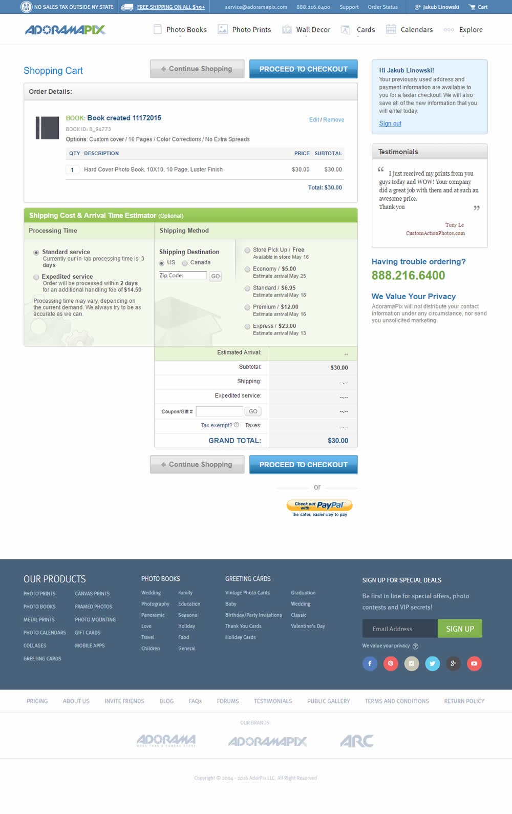
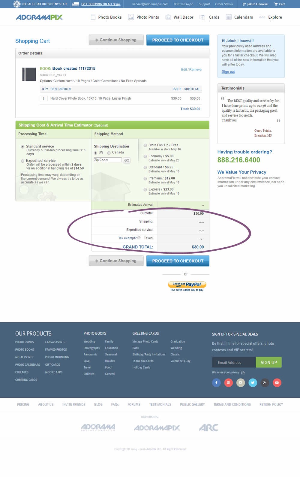
Remove the discount, coupon or promo code altogether. It makes people (without coupon codes) second guess themselves why they might not have received a coupon. Some people might also leave searching for coupon codes, never to come back and finish the purchase.
Median Effects
6%
Engagement
Ex: Any Action / Visit
(1 tests)
-
Conversions
Ex: Signups, Leads
2.5%
Sales
Ex: Transactions, Upsells
(4 tests)
24%
Revenue
Ex: AOV, LTV
(1 tests)
-
Retention
Ex: Return Visits
-
Referrals
Ex: Social Shares
Tests
Pattern #1: No Coupon Fields
Was Tested
by
Someone
Maybe It Worked Here
-
-
Measured by completed transactions | p-val 0.615591
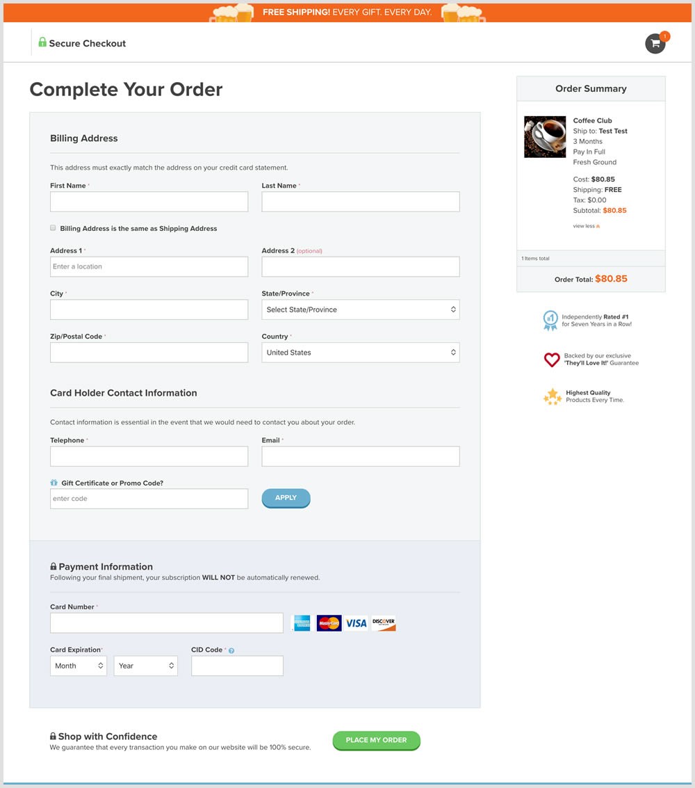
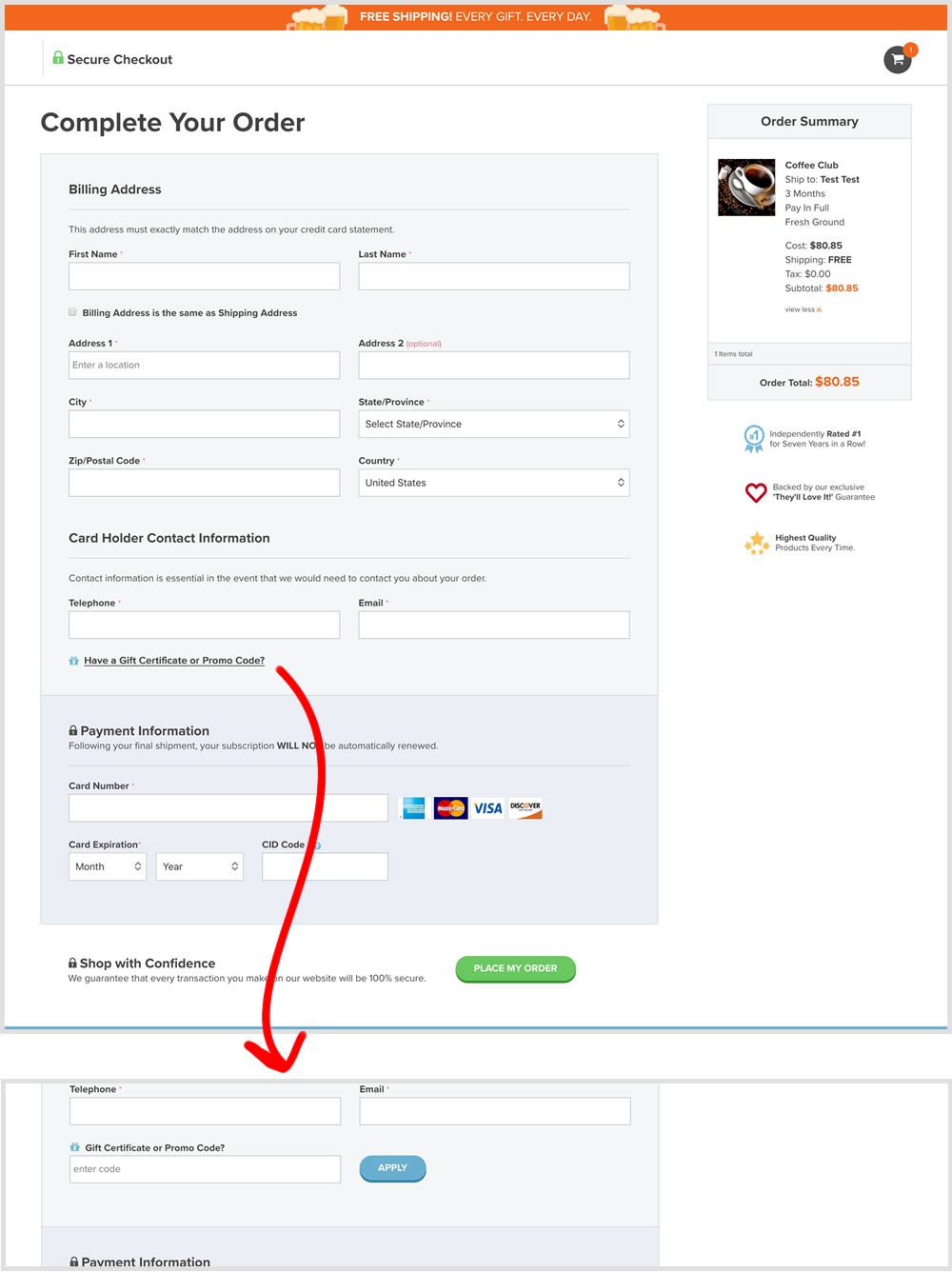
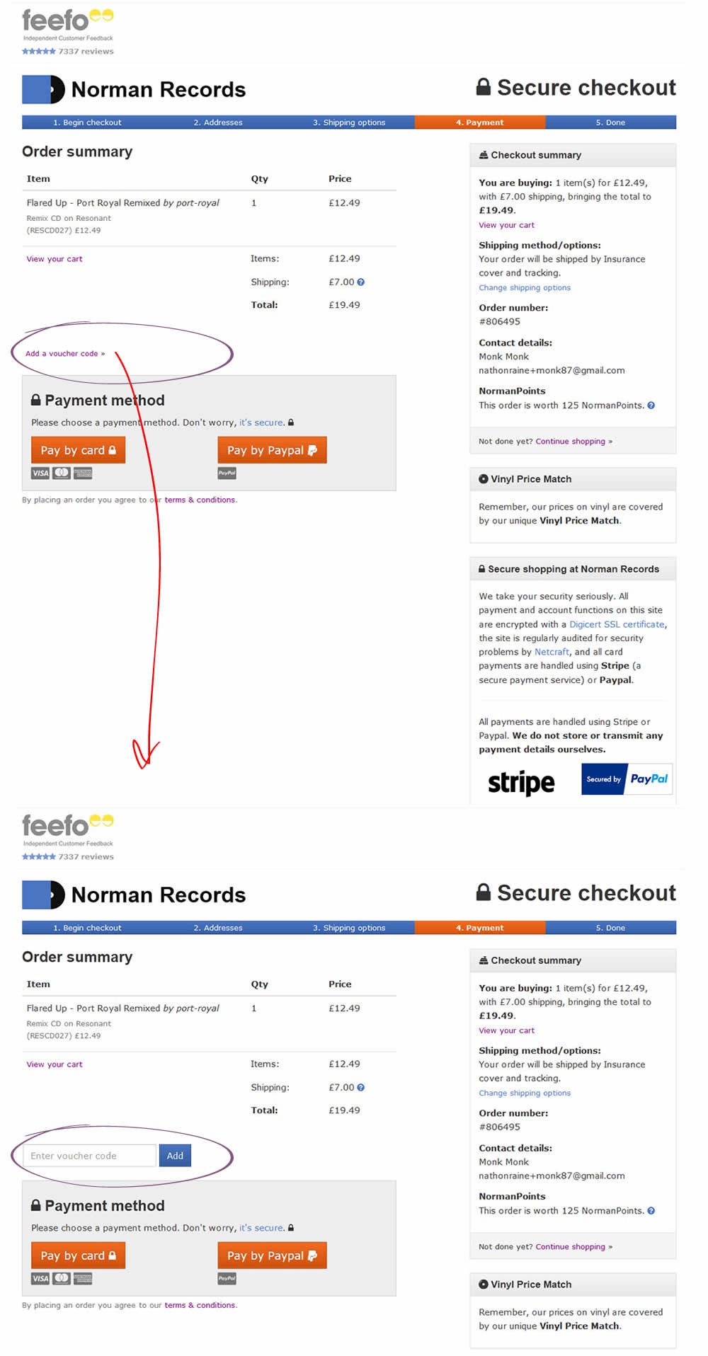
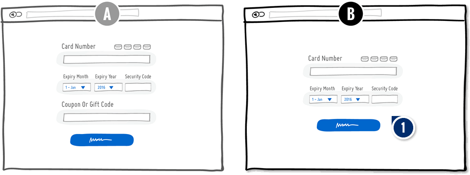
In this experiment, a fully visible coupon field (A) was made less visible by turning it into a default collaped link (B). Clicking on the link caused the coupon field to appear.
It Likely Worked Here
-
-
Measured by completed sales | p-val 0.207383
In this test the coupon field was replaced with a small link that would bring the field back if needed. This is a more suble approach than just completely removing the coupon field. It still allows for the use of coupon fields by those customers which are truly searching for a way to enter their aquired codes.
It Worked Here
-
-
Measured by visits to next step. | p-val 0.00001
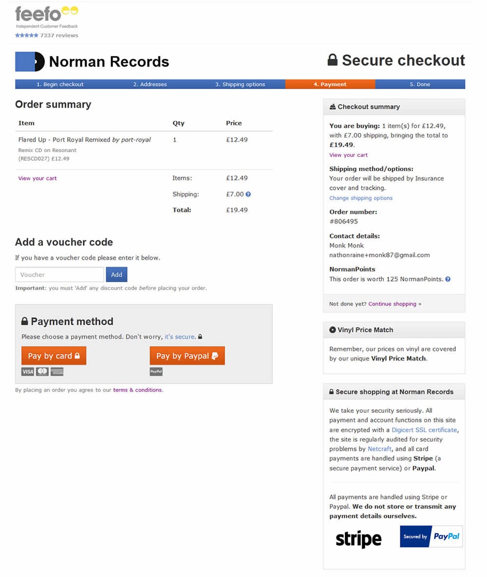
The test was run for an online retailer in the women’s clothing market (according to Conversion Doctor). The control (A) had a coupon code on the first page of the checkout process. The variation (B) had the coupon code removed.
It Worked Here
-
Measured by visits to shopping cart | p-val 0.00001
-
Measured by post-purchase page visits | p-val 0.0127757
Maybe It Worked Here
 A
A
 B
B
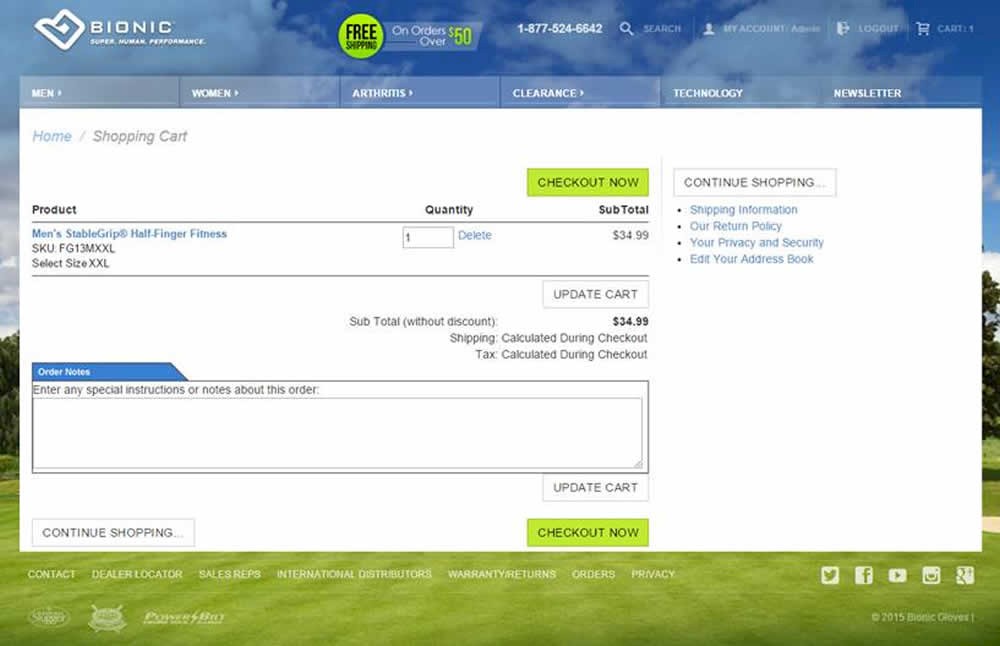
Source: vwo.com/blog/promo-code-box-ecommerce-website-bleeding-dollars-ab-test/
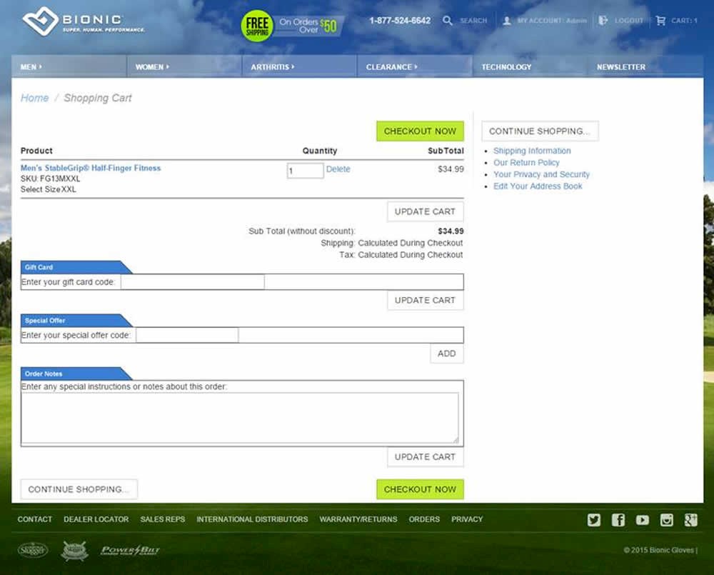
VWO.com published this test which removed two coupon fields on a shopping cart: a gift card code and a special offer code.
For each pattern, we measure three key data points derived from related tests:
REPEATABILITY - this is a measure of how often a given pattern has generated a positive or negative effect. The higher this number, the more likely the pattern will continue to repeat.
SHALLOW MEDIAN - this is a median effect measured with low intent actions such as initiating the first step of a lengthier process
DEEP MEDIAN - this is derived from the highest intent metrics that we have for a given test such as fully completed signups or sales.


