Pattern #14: Exposed Menu Options Save Pattern Bookmark

Pattern Author: Jakub Linowski - Founder & Editor @ GoodUI.org

Based on 7 Tests, Members See How Likely This Pattern Will Win Or Lose And Its (?) Median Effect
Almost Certain Loser
-5
-4
-3
-2
-1
0
+1
+2
+3
+4
+5
Almost Certain Winner
Exposed Menu Options
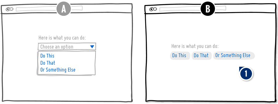
  1. Add: Expose Options Exposing Options

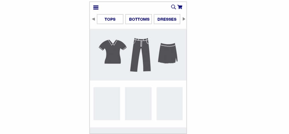
    In this pattern options are made more visible by being taken out of a collapsable menu. This encourages people to make choices they might not have thought were there.

Median Effects

?

Engagement

Ex: Any Action / Visit

(5 tests)

?

Conversions

Ex: Signups, Leads

(3 tests)

?

Sales

Ex: Transactions, Upsells

(3 tests)

?

Revenue

Ex: AOV, LTV

?

Retention

Ex: Return Visits

?

Referrals

Ex: Social Shares

Tests

Pattern #14: Exposed Menu Options
Was Tested by Devesh Khanal

Test #186 Tested on An Anonymous Site Jul 02, 2018

Find Out How It Performed With 76,974 Visitors

Home & Landing Mobile
  • Measured by visits to product pages   |   p-val (?)

  • Measured by product orders   |   p-val (?)

Get Access To See The Test Results

The Same Pattern Was Also Tested Here

Test #269 Tested on Thomasnet.com by Julian Gaviria Julian Nov 15, 2019

Find Out How It Performed With 6,168 Visitors

Home & Landing Desktop
  • Measured by total searches (from any 6 categories)   |   p-val (?)

  • Measured by registrations from detail pages   |   p-val (?)

In this experiment, the variation exposed 6 of the options from the pulldown menu as tabs.

Get Access To See The Test Results

Test #268 Tested on Backstage.com by Stanley Zuo Stanley Nov 08, 2019

Find Out How It Performed With 208,456 Visitors

Listing Mobile
  • Measured by visits to detail page   |   p-val (?)

  • Measured by starts subscription flow   |   p-val (?)

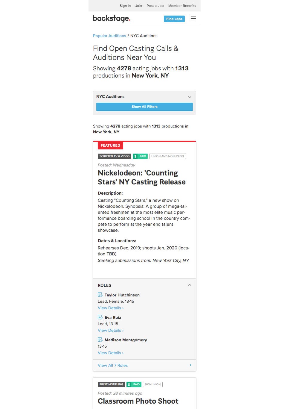
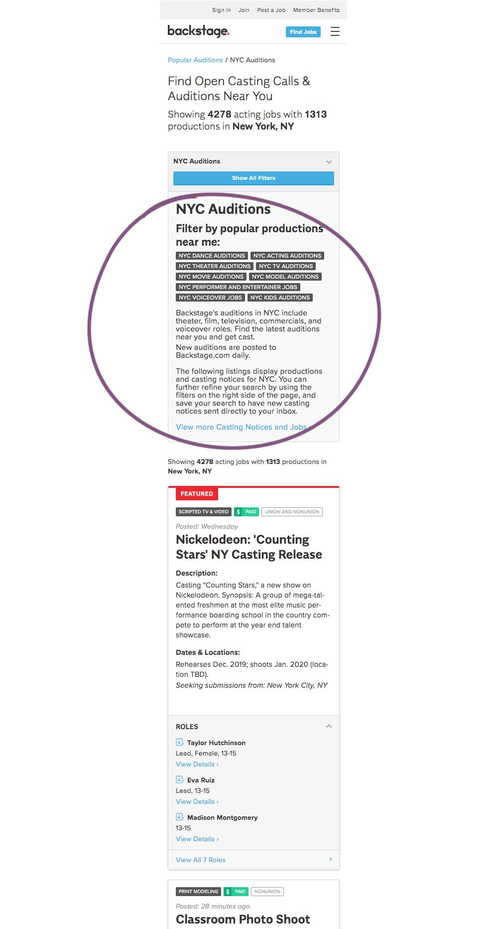
The change in this experiment was an exposed SEO panel (B) with a number of clickable filter options. 

Get Access To See The Test Results

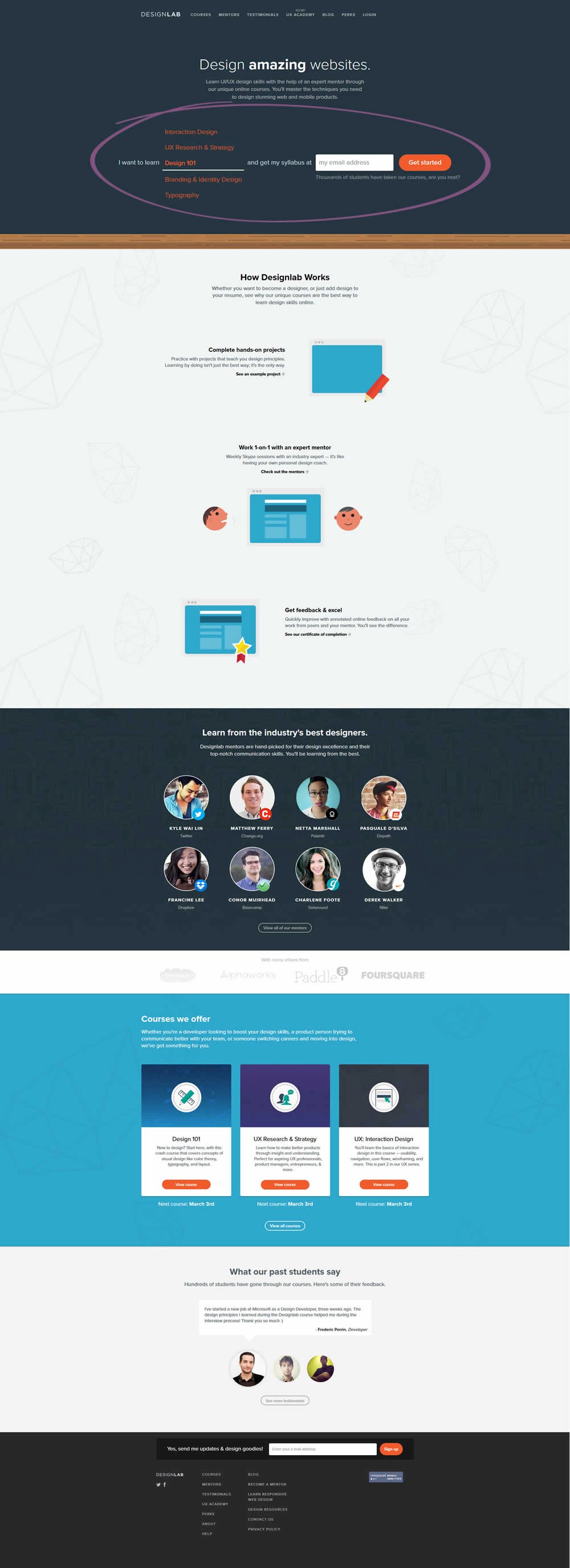
Test #110 Tested on Trydesignlab.com by Daniel Shapiro Daniel Jul 01, 2017

Find Out How It Performed With 21,129 Visitors

Home & Landing
  •  

  • Measured by form submits   |   p-val (?)

Get Access To See The Test Results

Test #107 Tested on Examine.com by Martin Wong Martin May 22, 2017

Find Out How It Performed With 10,662 Visitors

Product
  • Measured by checkout page visits   |   p-val (?)

  • Measured by total sales   |   p-val (?)

Get Access To See The Test Results

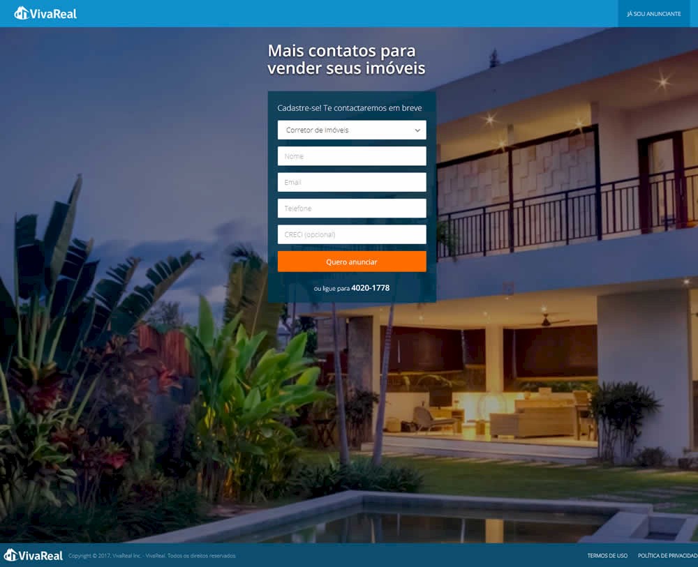
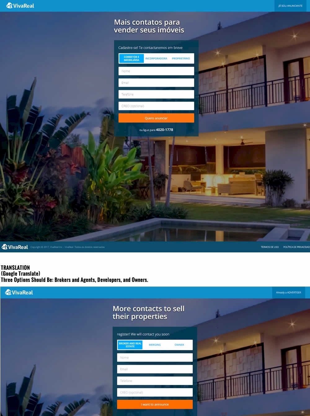
Test #94 Tested on Vivareal.com.br by Rodrigo Maués Rodrigo Feb 01, 2017

Find Out How It Performed With 20,709 Visitors

Signup
  •  

  • Measured by successful form submits   |   p-val (?)

Get Access To See The Test Results

Test #55 Tested on Autodesk.com by Lisa Seaman Aug 11, 2016

Find Out How It Performed

Home & Landing
  • Measured by visits to trial page   |   p-val (?)

  •  

In this test, some of the menu options (accessible in the top right hamburger menu) were copied over onto the top navigation. The options that were exposed were "All Products", "Free Trial" and "Buy".

Get Access To See The Test Results

Leaks

Leak #2 from Booking.com   |   Mar 8, 2019 Home & Landing

Booking.com A/B Tested And Exposed Incremental UI Controls

I especially like this particular leak because there is a slight possibility I might have actually inspired Booking to a/b test it - how cool is that? In late November of 2018 I shared some search concepts, one of which suggested incremental UI controls for Booking's guest selector. View Leak

Leak #6 from Booking.com/apartments   |   Apr 22, 2019 Home & Landing

Booking A/B Tested And Rolled Out An Expanded Calendar Control

This leaked experiment captures a very simple and isolated change on Booking's apartment landing page. The tested change was the automatic exposure of the calendar menu instead of keeping it collapsed (requiring an extra click to open the date picker). A few weeks later, the experiment was observed to have been completed with the exposed calendar version (B) as implemented. View Leak

Leak #37 from Bol.com   |   Dec 17, 2019 Listing

Bol Discovers Something Better Than Classic Pulldown Menus, As Expected

When Bol ran their list vs grid view experiment, they also included a variation that tested for another very simple change: the exposure of menu options. That is, the listing page variant was designed to check if three more visible pull down options would be better or worse than just showing them hidden inside the pulldown. View Leak

For each pattern, we measure three key data points derived from related tests:

REPEATABILITY - this is a measure of how often a given pattern has generated a positive or negative effect. The higher this number, the more likely the pattern will continue to repeat.

SHALLOW MEDIAN - this is a median effect measured with low intent actions such as initiating the first step of a lengthier process

DEEP MEDIAN - this is derived from the highest intent metrics that we have for a given test such as fully completed signups or sales.