Pattern #20: Canned Response Save Pattern Bookmark
Pattern Author:
 Jakub Linowski
- Founder & Editor @ GoodUI.org
Based on 9 Tests, Members See How Likely This Pattern Will Win Or Lose And Its (?) Median Effect
-
Add: Textarea Field Fewer Form Fields
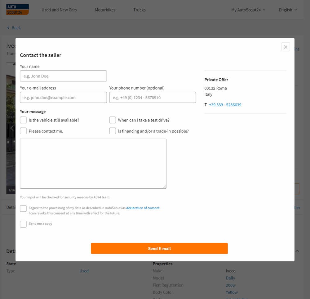
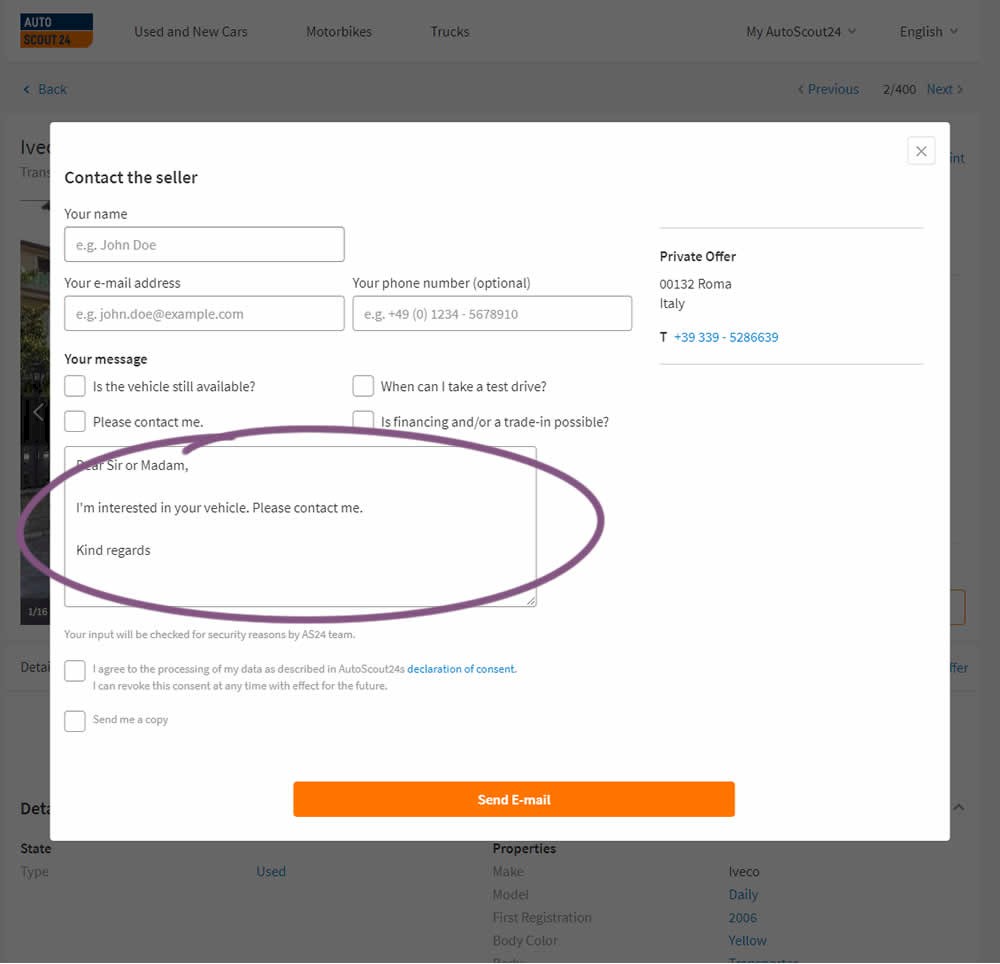
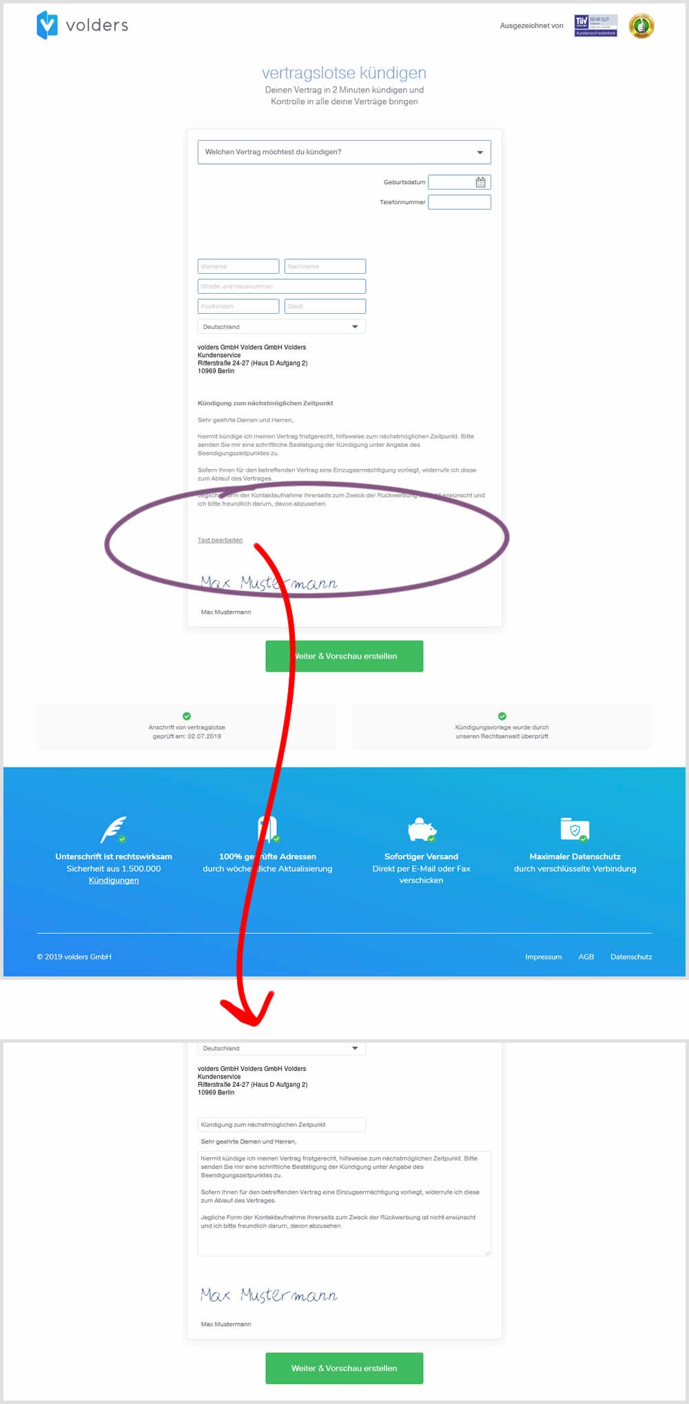
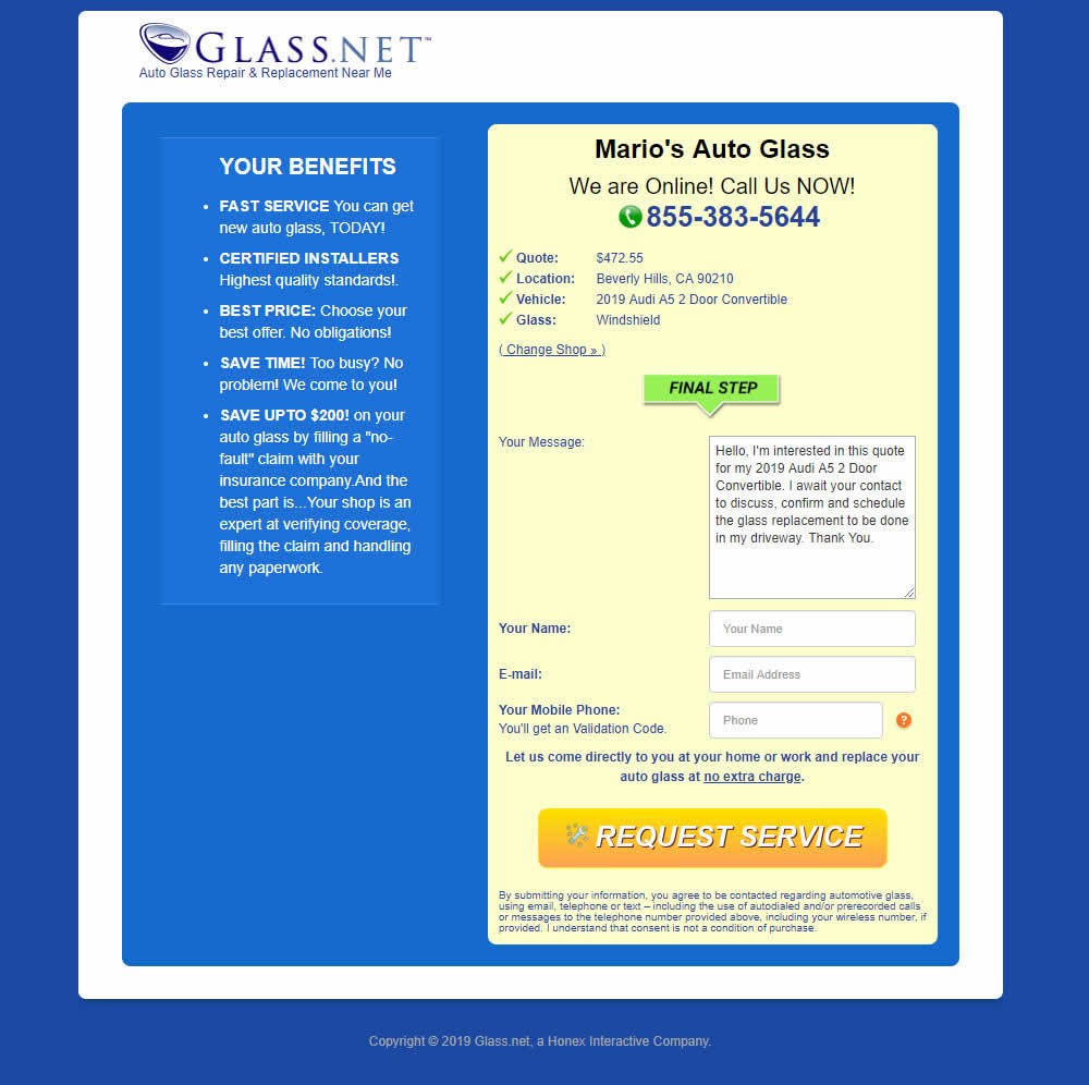
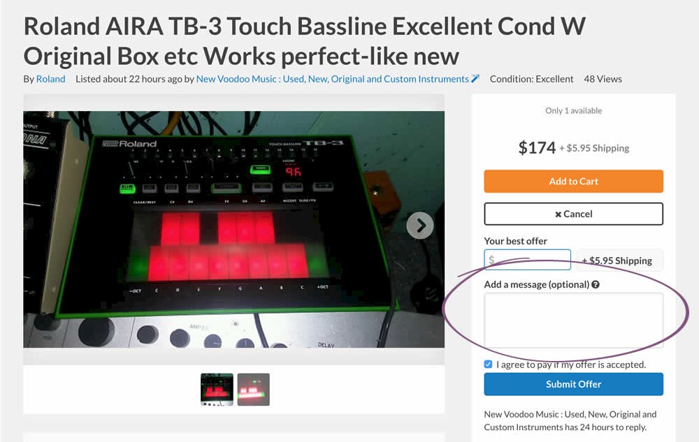
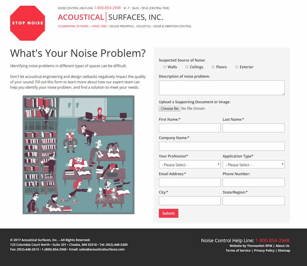
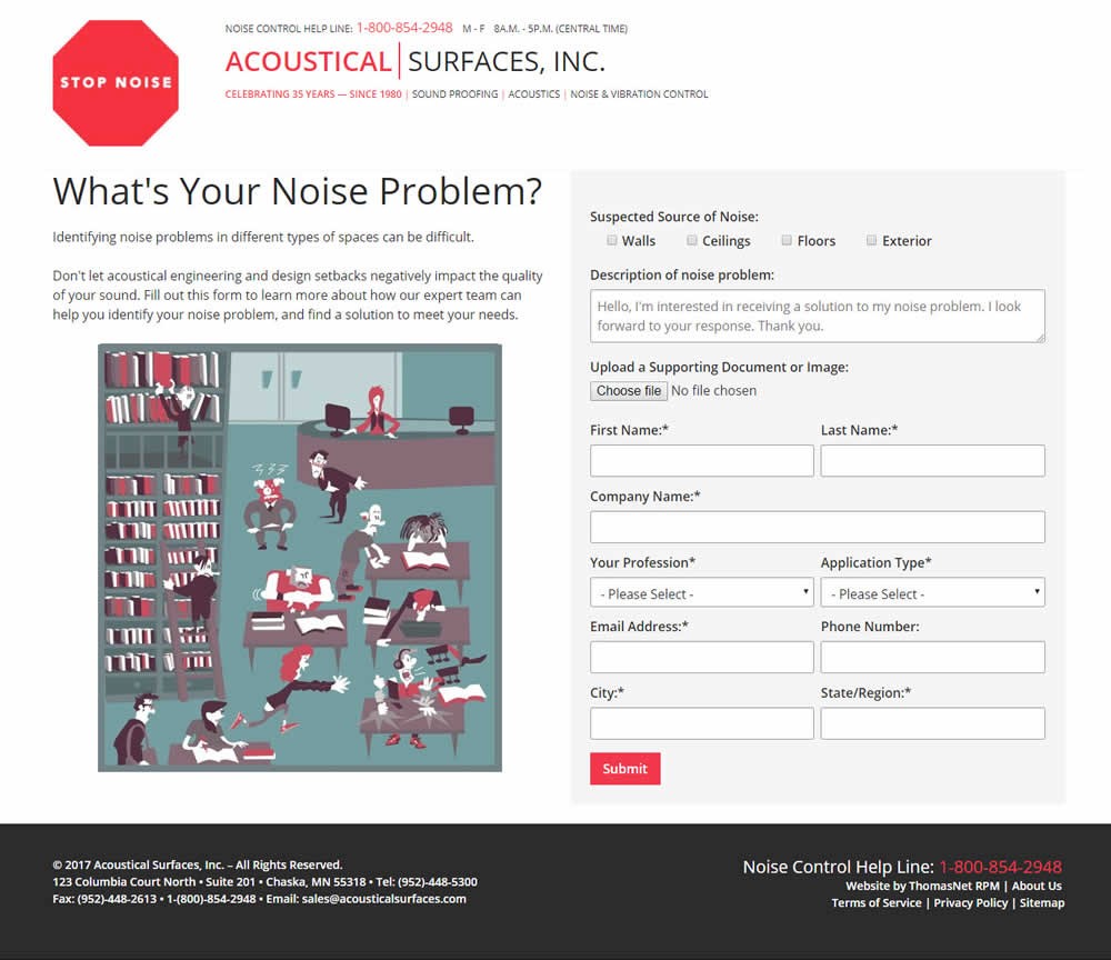
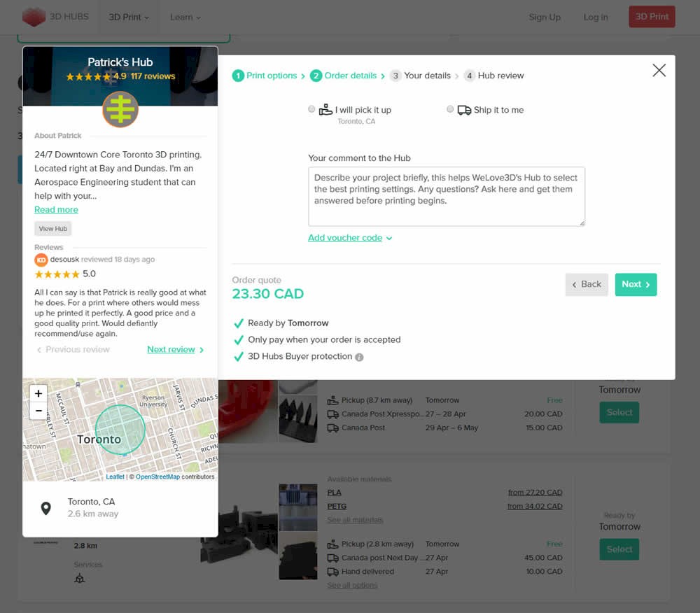
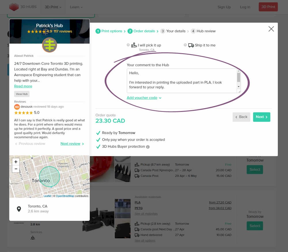
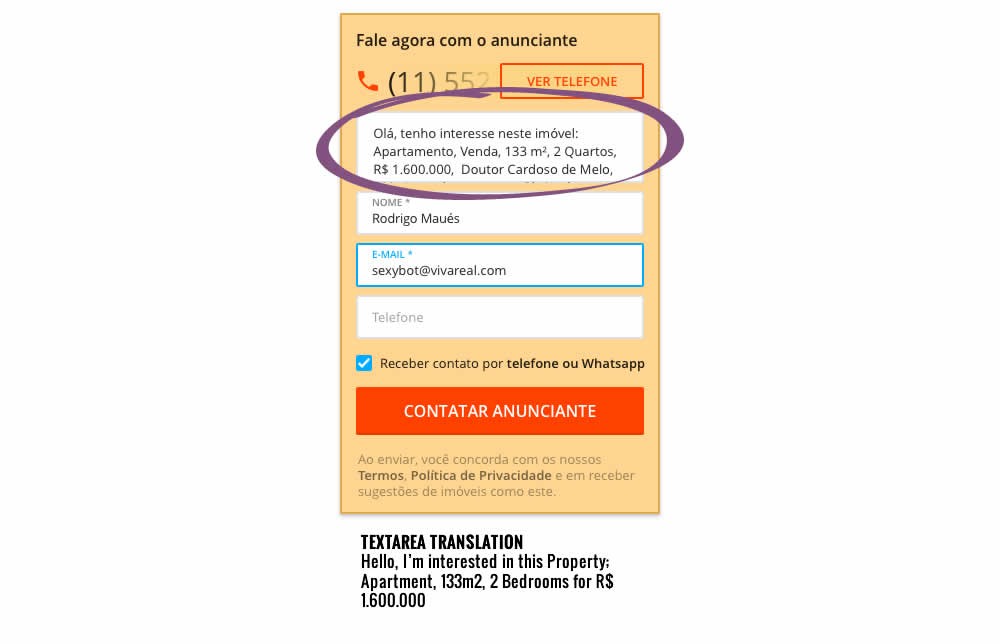
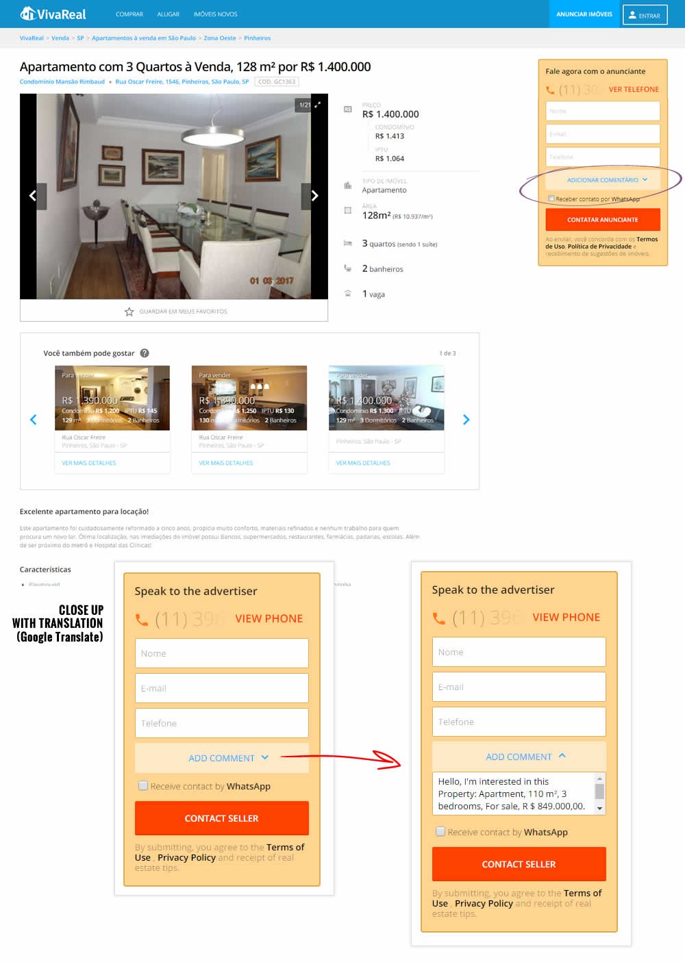
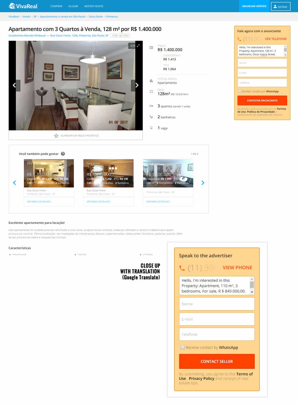
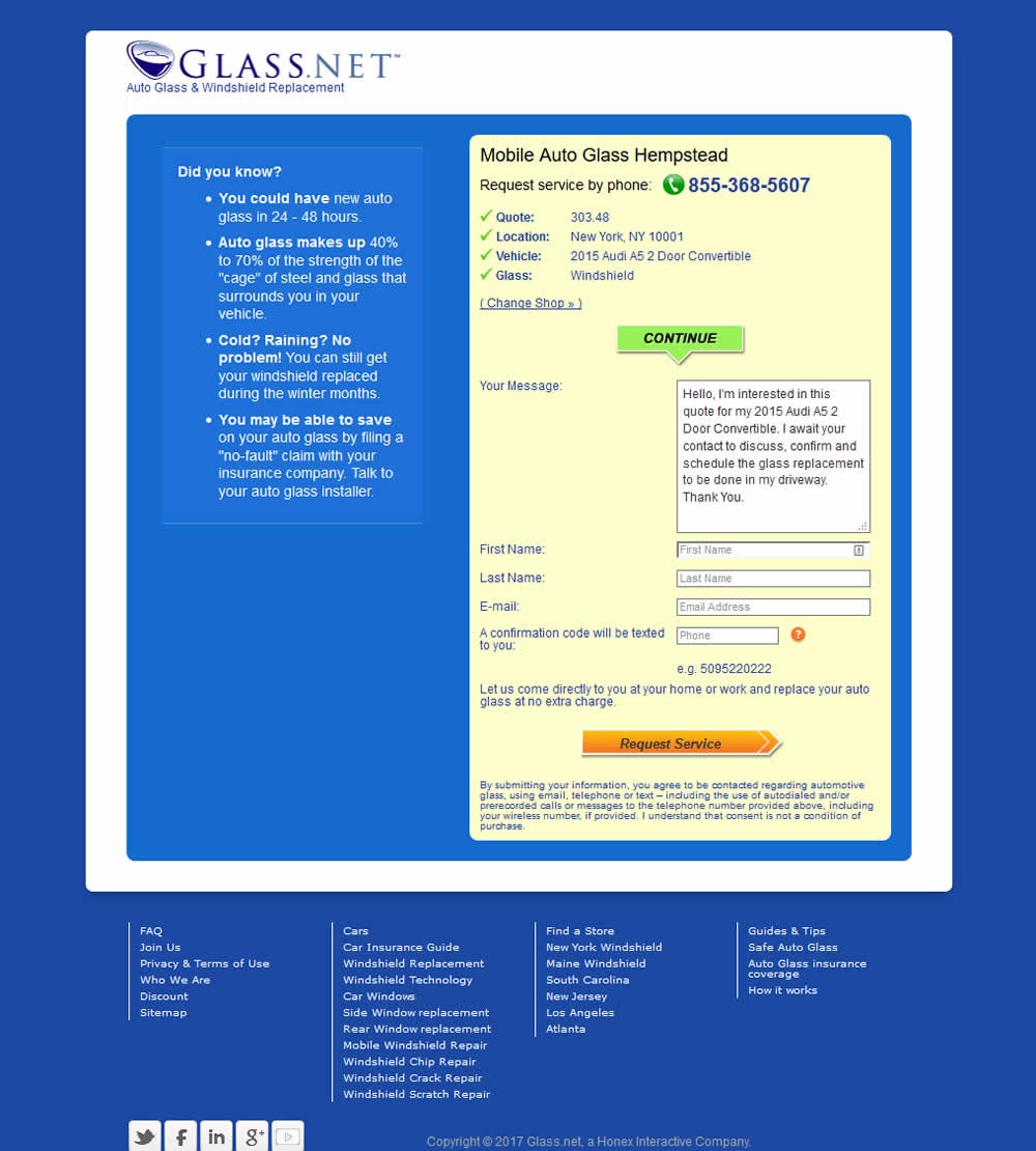
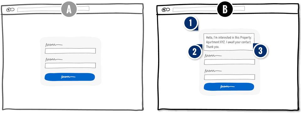
Counter intuitively, in this pattern we actually show a big textarea field and position it as the first one.
-
Add: First Person Copy With Past Choice Smart Defaults
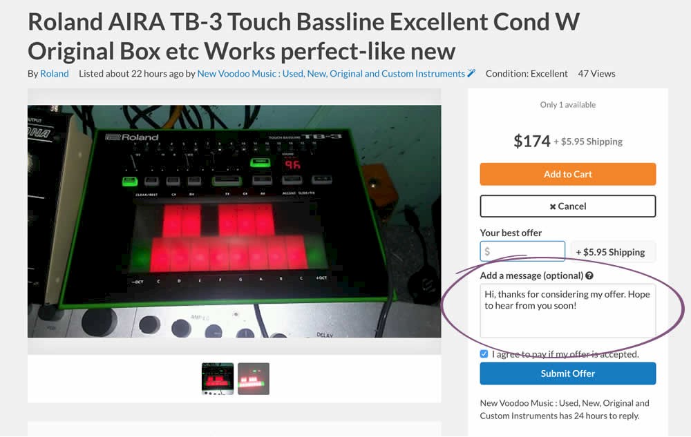
The textarea field is then defaulted with a custom message written in the first person. As the second sentence, a previously made choice (by the user) is surfaced. This could be some particular item or product that users showed interest in on previous screens. This is meant to increase relevancy of the message.
-
Add: Response Reassurance
Finally, the last sentence explicitly mentions that the user is expecting a response followed by a "thank you". This increases the feeling that the user will receive a response and removes the risk of rejection (from investing effort into filling out the form and not hearing back).
Median Effects
?
Engagement
Ex: Any Action / Visit
(3 tests)
?
Conversions
Ex: Signups, Leads
(7 tests)
?
Sales
Ex: Transactions, Upsells
(2 tests)
?
Revenue
Ex: AOV, LTV
?
Retention
Ex: Return Visits
?
Referrals
Ex: Social Shares
For each pattern, we measure three key data points derived from related tests:
REPEATABILITY - this is a measure of how often a given pattern has generated a positive or negative effect. The higher this number, the more likely the pattern will continue to repeat.
SHALLOW MEDIAN - this is a median effect measured with low intent actions such as initiating the first step of a lengthier process
DEEP MEDIAN - this is derived from the highest intent metrics that we have for a given test such as fully completed signups or sales.


