Pattern #3: Fewer Form Fields Save Pattern Bookmark
Pattern Author:
 Jakub Linowski
- Founder & Editor @ GoodUI.org
Based on 9 Tests, Members See How Likely This Pattern Will Win Or Lose And Its (?) Median Effect
-
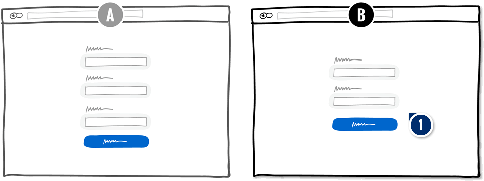
Remove: Form Fields Fewer Form Fields
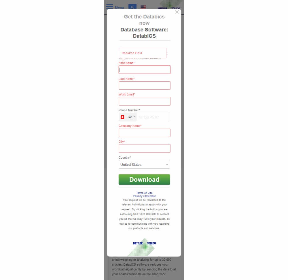
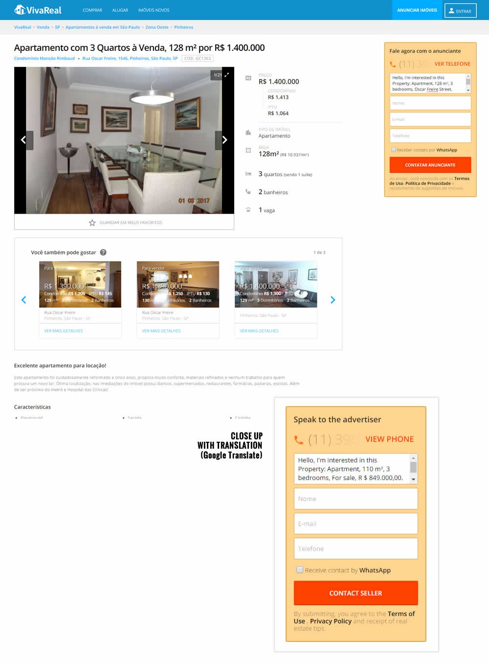
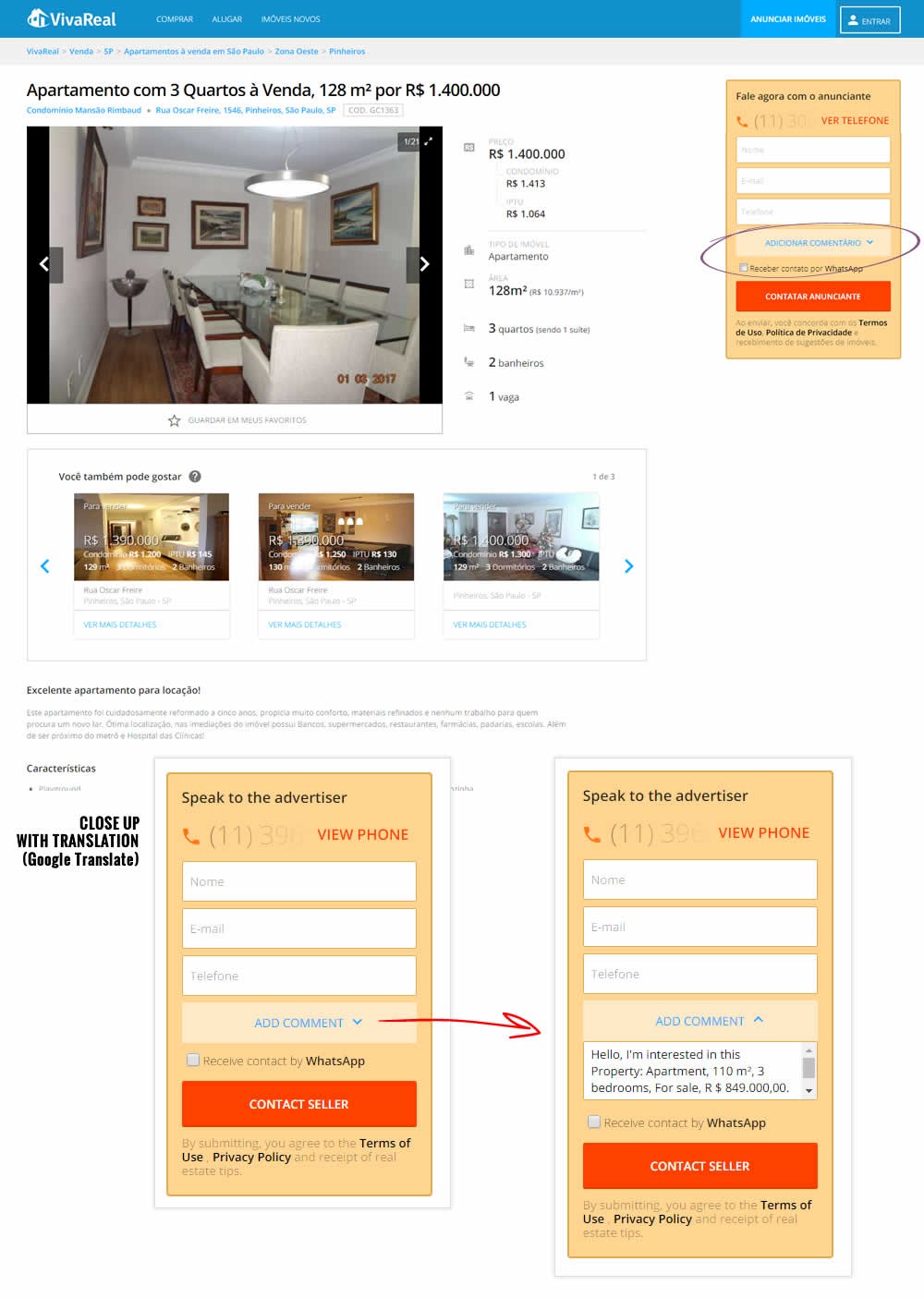
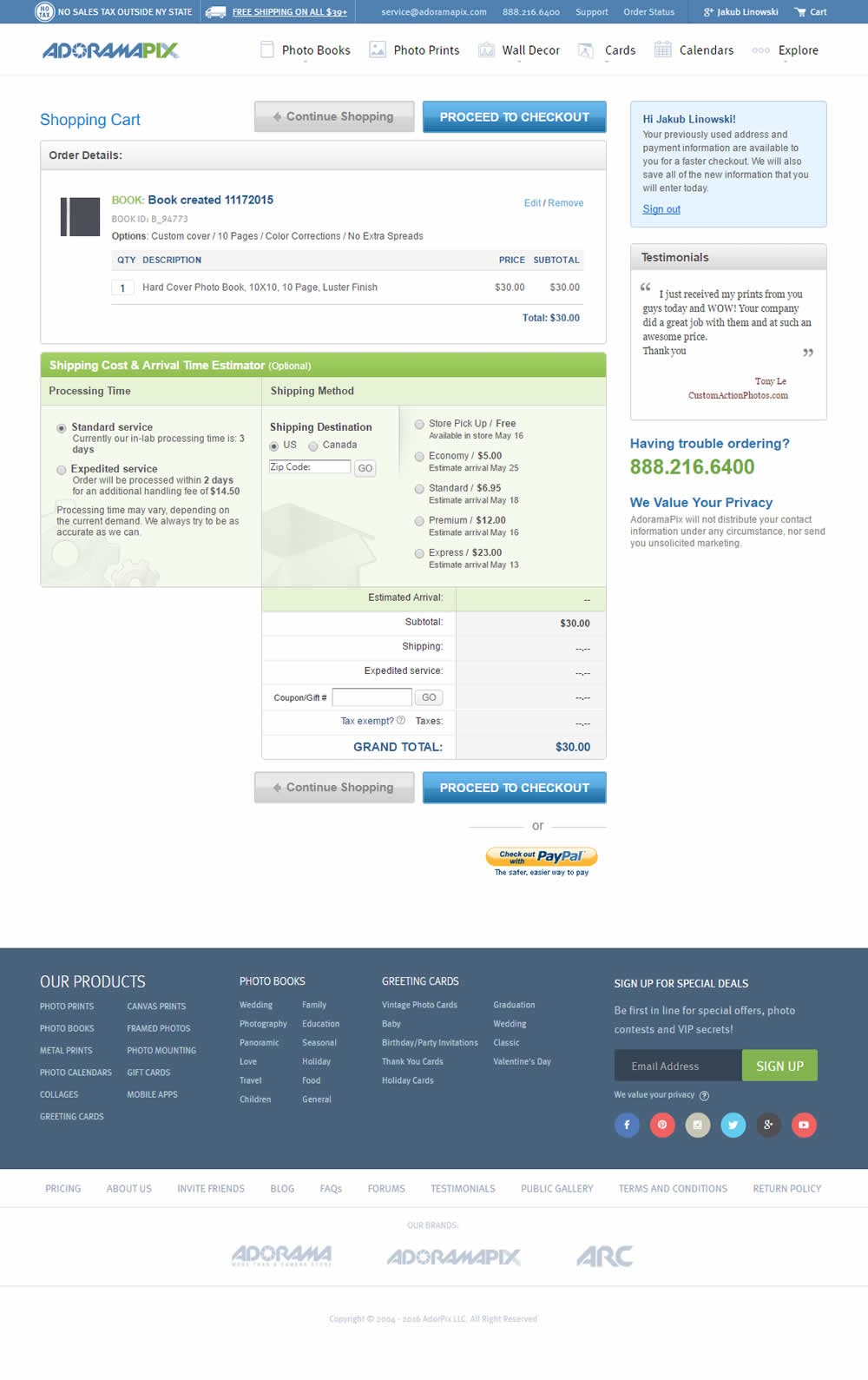
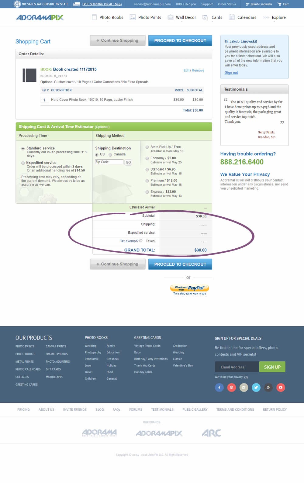
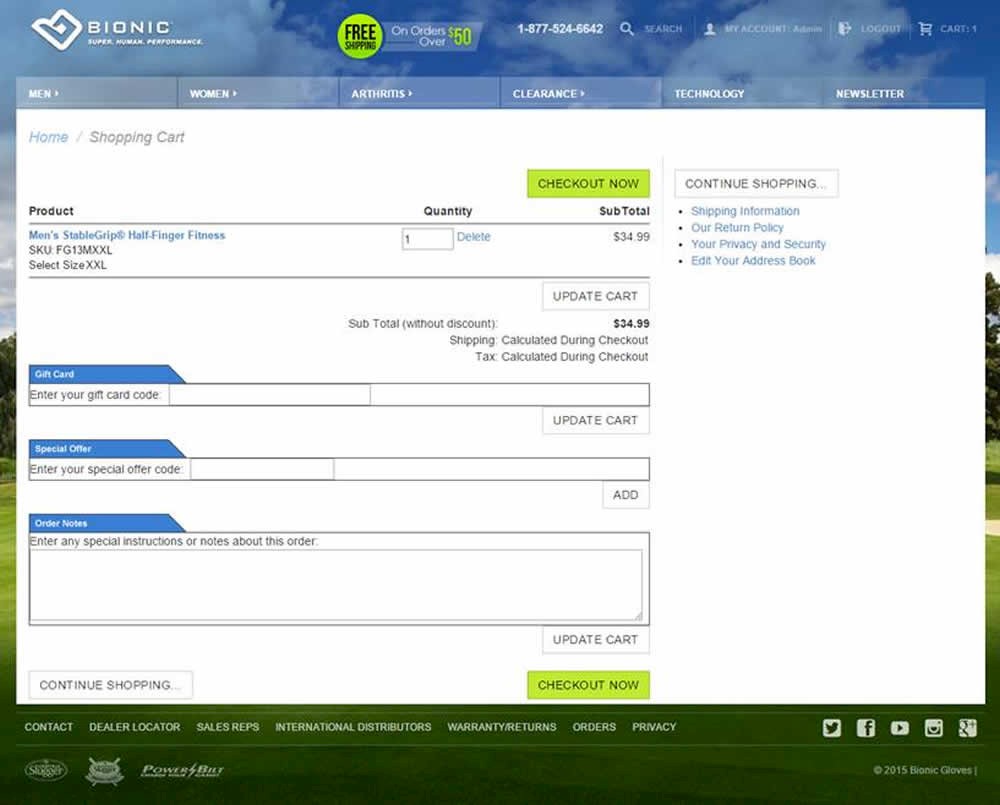
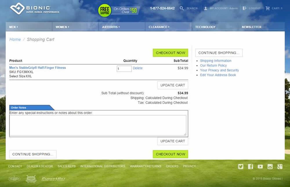
This little pattern suggests to get rid of as many form fields as possible on the basis that they cause friction.
Median Effects
?
Engagement
Ex: Any Action / Visit
(4 tests)
?
Conversions
Ex: Signups, Leads
(4 tests)
?
Sales
Ex: Transactions, Upsells
(3 tests)
?
Revenue
Ex: AOV, LTV
(1 tests)
?
Retention
Ex: Return Visits
?
Referrals
Ex: Social Shares
Leaks
Booking A/B Tested 3 Search Bars Challenging The Fewer Form Fields Pattern
I've been watching this Booking experiment closely ever since sharing a very similar concept some months ago. Their homepage was openly challenged with the UI hypothesis of exposing a "room quantity" field right in the search bar (instead of hiding it in a pulldown menu). And their team took the initiative to run a test. Based on the observed outcome and roll out decision it turns out that the UI concept was better than their control. View Leak
For each pattern, we measure three key data points derived from related tests:
REPEATABILITY - this is a measure of how often a given pattern has generated a positive or negative effect. The higher this number, the more likely the pattern will continue to repeat.
SHALLOW MEDIAN - this is a median effect measured with low intent actions such as initiating the first step of a lengthier process
DEEP MEDIAN - this is derived from the highest intent metrics that we have for a given test such as fully completed signups or sales.


