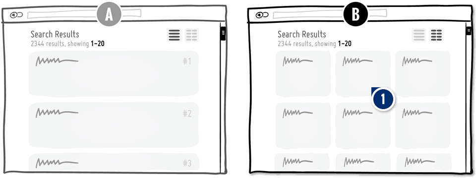
Pattern #37: List Vs. Grid View Save Pattern Bookmark
Pattern Author:
 Rodrigo Maués
- Head of Product Design @ Anheuser-Busch InBev
Based on 4 Tests, Members See How Likely This Pattern Will Win Or Lose And Its (?) Median Effect

-
Replace: Grid View Choice
This pattern suggests to show results in a grid view instead of a list one.
Median Effects
?
Engagement
Ex: Any Action / Visit
(3 tests)
?
Conversions
Ex: Signups, Leads
(2 tests)
?
Sales
Ex: Transactions, Upsells
(1 tests)
?
Revenue
Ex: AOV, LTV
?
Retention
Ex: Return Visits
?
Referrals
Ex: Social Shares
Leaks
Bol A/B Tests The UI Classic: List Vs Grid View With A Clear Decision
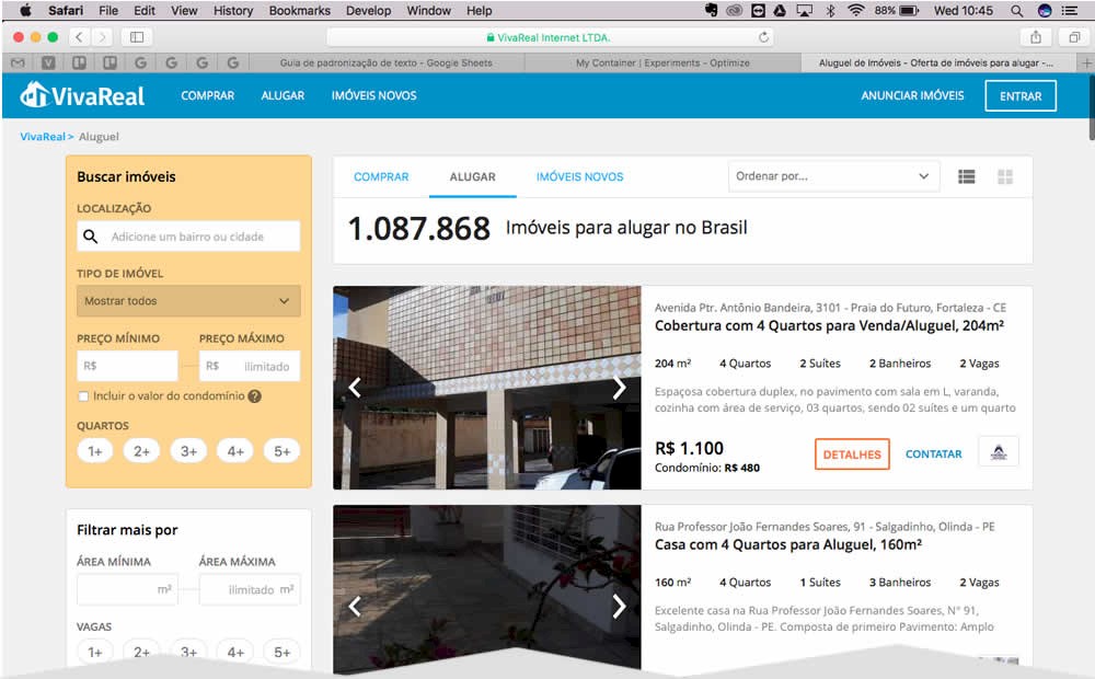
I am continously interested in answering and providing guidance on whether grid or list views are in general better, worse or indifferent as one of many UI patterns. To my surprise, Bol.com the leading Dutch web shop, has recently a/b tested this classic pattern which we were super lucky to detect on their red wine product listing pages. After anticipating their leaked design decision, we eventually learned that lists fared better for Bol. This of course we'll now use as additional and emerging evidence to tip the scales of probability (and hopefully better predict similar future experiments). View Leak
Google Also A/B Tests The List Vs The Grid
Interestingly, Google was also discovered a/b testing the list vs grid pattern just as Bol finished a similar experiment this month. The Google experiment ran on one of their shopping results pages with the specific query for "flowers". And the outcome? Looks like the grid beat the list and was rolled out in this case. View Leak
For each pattern, we measure three key data points derived from related tests:
REPEATABILITY - this is a measure of how often a given pattern has generated a positive or negative effect. The higher this number, the more likely the pattern will continue to repeat.
SHALLOW MEDIAN - this is a median effect measured with low intent actions such as initiating the first step of a lengthier process
DEEP MEDIAN - this is derived from the highest intent metrics that we have for a given test such as fully completed signups or sales.


