Pattern #41: Sticky Call To Action Save Pattern Bookmark

Pattern Author: Carl Muszynski - Head of UX @ Conversionista!

Based on 7 Tests, Members See How Likely This Pattern Will Win Or Lose And Its (?) Median Effect
Almost Certain Loser
-5
-4
-3
-2
-1
0
+1
+2
+3
+4
+5
Almost Certain Winner
Sticky Call To Action
  1. Add: Floating Call To Action

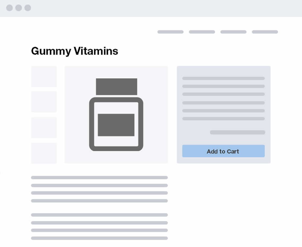
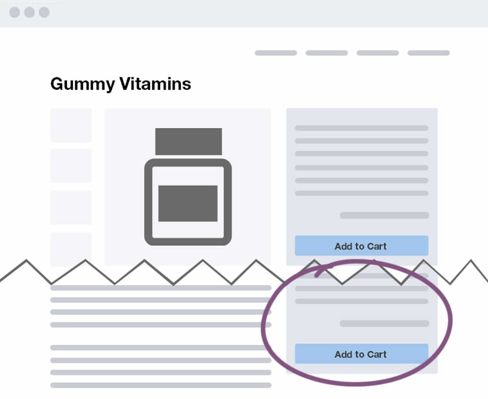
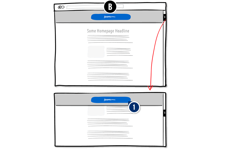
    Increase the visibility of the primary call to action with a persistent (floating) behavior. The button can be positioned and made to stick at the top or bottom of the screen.

Median Effects

?

Engagement

Ex: Any Action / Visit

(7 tests)

?

Conversions

Ex: Signups, Leads

(3 tests)

?

Sales

Ex: Transactions, Upsells

(3 tests)

?

Revenue

Ex: AOV, LTV

?

Retention

Ex: Return Visits

?

Referrals

Ex: Social Shares

Tests

Test #264 Tested on Kenhub.com by Niels Hapke Niels Oct 05, 2019

Find Out How It Performed With 50,572 Visitors

Global Desktop, Mobile
  • Measured by visits to pricing page   |   p-val (?)

  • Measured by successful premium subscriptions   |   p-val (?)

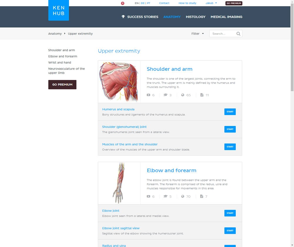
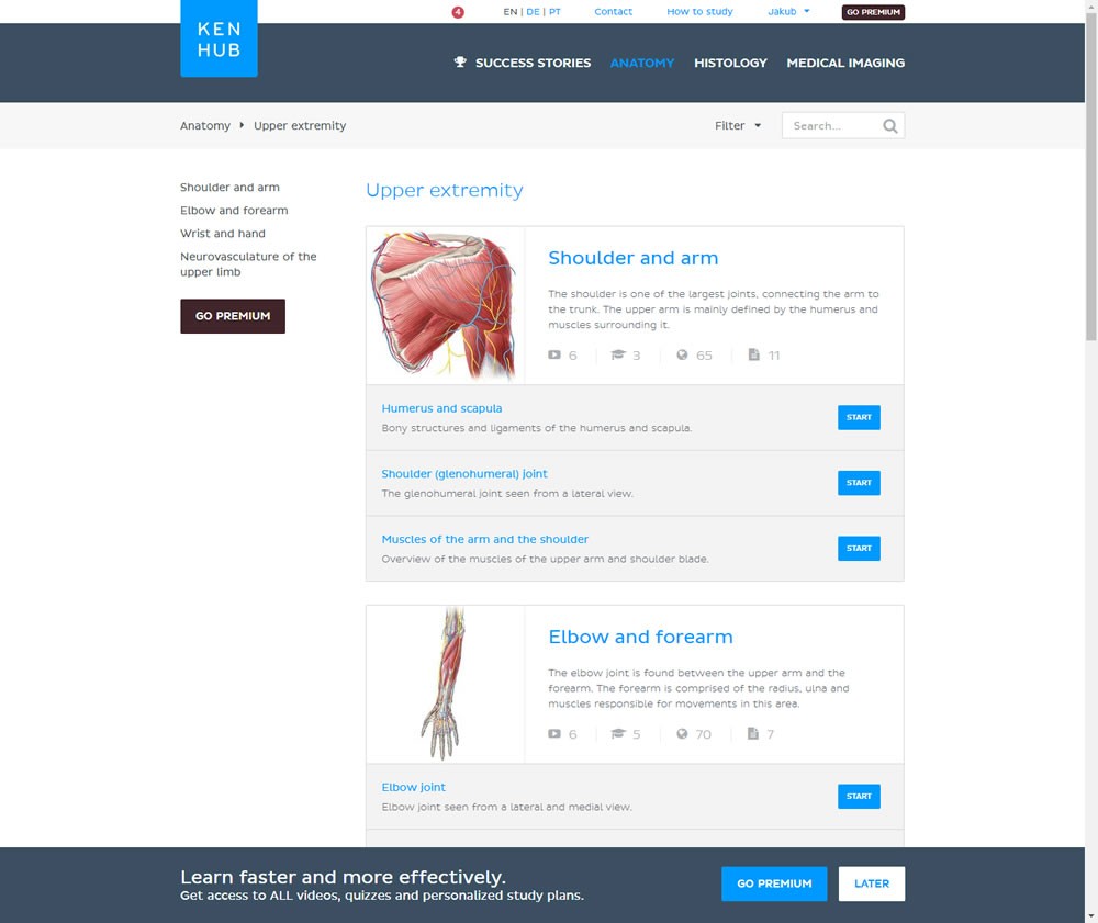
In this experiment users saw a sticky bar advertising the benefits of a Premium account across the bottom of the website, wherever they navigate. The sticky call to action appeared with a 4 second delay and was floating.

Get Access To See The Test Results

Test #247 Tested on Thomasnet.com by Julian Gaviria Julian Jun 13, 2019

Find Out How It Performed With 76,900 Visitors

Content Desktop, Mobile
  • Measured by visits to signup landing page   |   p-val (?)

  • Measured by visits to signup landing page   |   p-val (?)

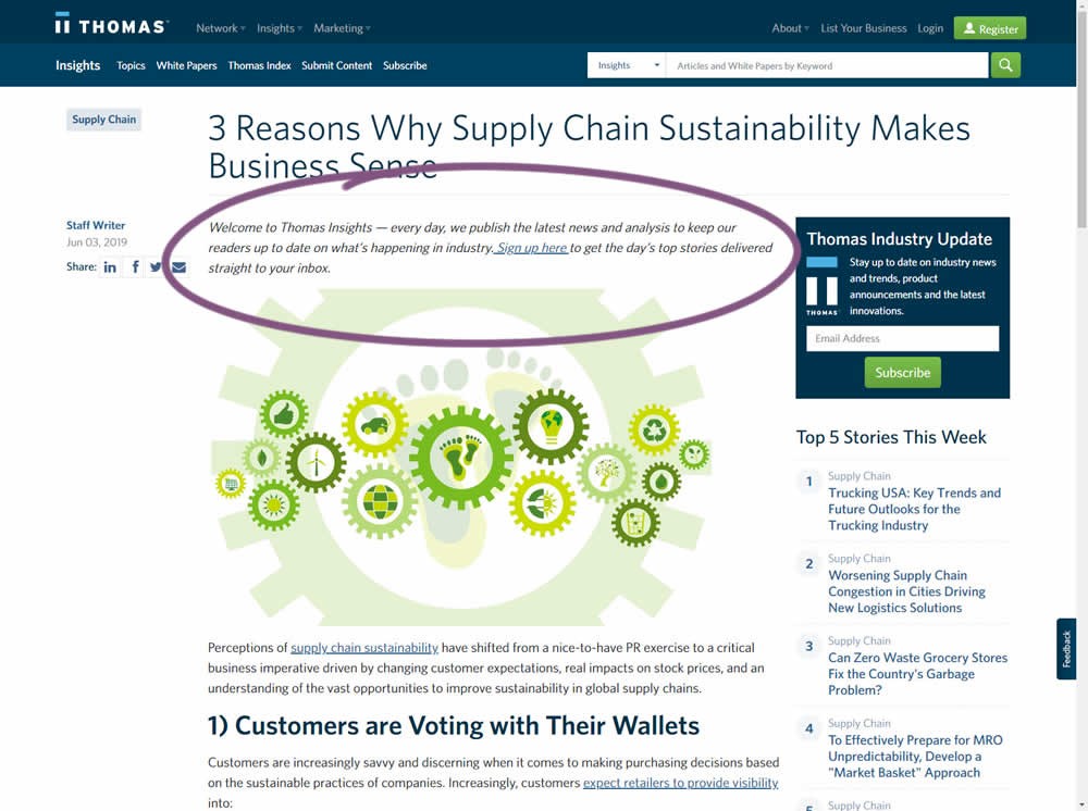
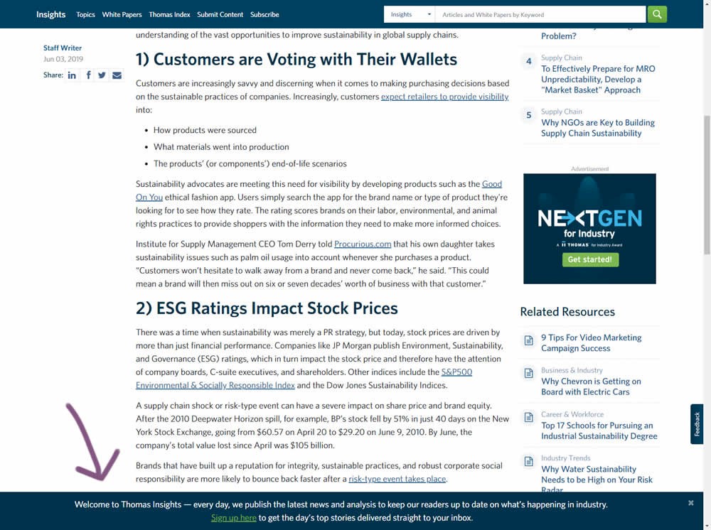
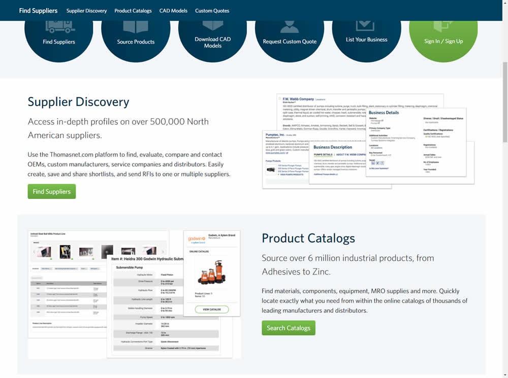
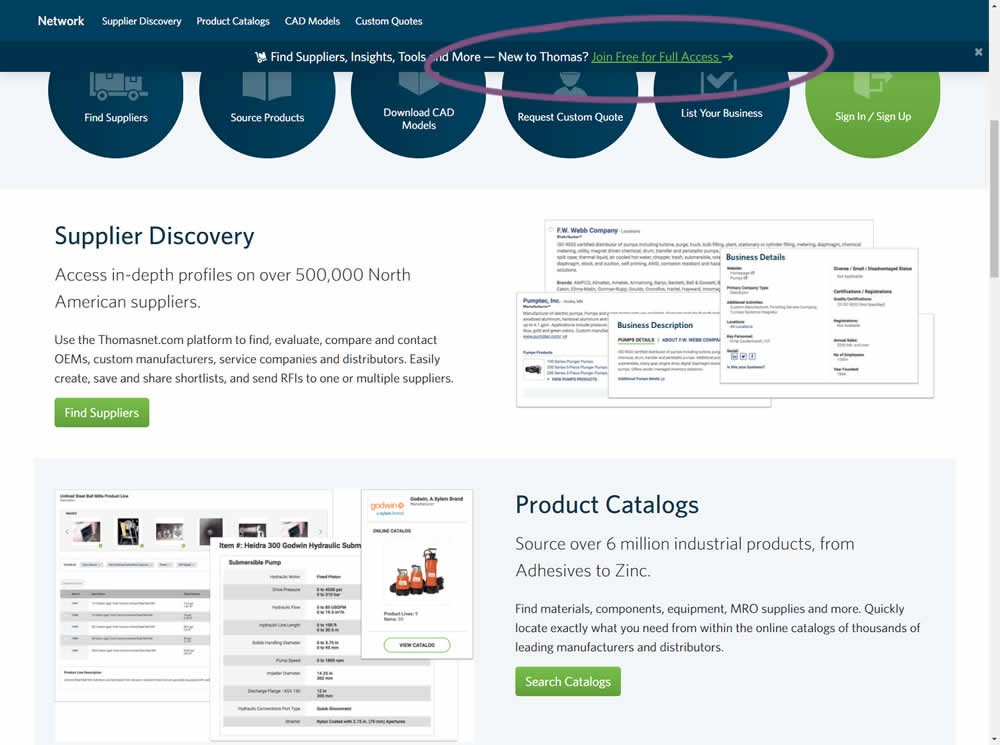
In this experiment, the same message (with a link) for signing up to a newsletter was shown in two distinct ways. The control (A) showed the signup message as inline one that preceded the content of the article at the very top. The variant showed the same signup message as a scroll-delayed sticky interaction at the bottom of the screen. The background colorĀ of the B variant was also inverted to match the style of the footer.

Get Access To See The Test Results

Test #225 Tested on An Anonymous Site Feb 17, 2019

Find Out How It Performed With 53,908 Visitors

Product Desktop
  • Measured by adds to cart   |   p-val (?)

  • Measured by total orders completed   |   p-val (?)

Get Access To See The Test Results

Test #217 Tested on Thomasnet.com by Julian Gaviria Julian Jan 03, 2019

Find Out How It Performed

Home & Landing Desktop, Mobile
  • Measured by visits to registration form   |   p-val (?)

  •  

Get Access To See The Test Results

Test #64 Tested on Goodui.org by Jakub Linowski Jakub Jan 01, 2017

Find Out How It Performed With 35,058 Visitors

Home & Landing
  • Measured by visits to any of the 5 nav links   |   p-val (?)

  • Measured by successful newsletter signups   |   p-val (?)

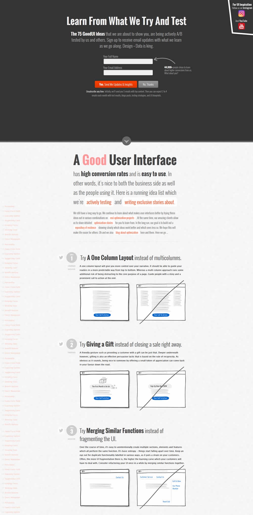
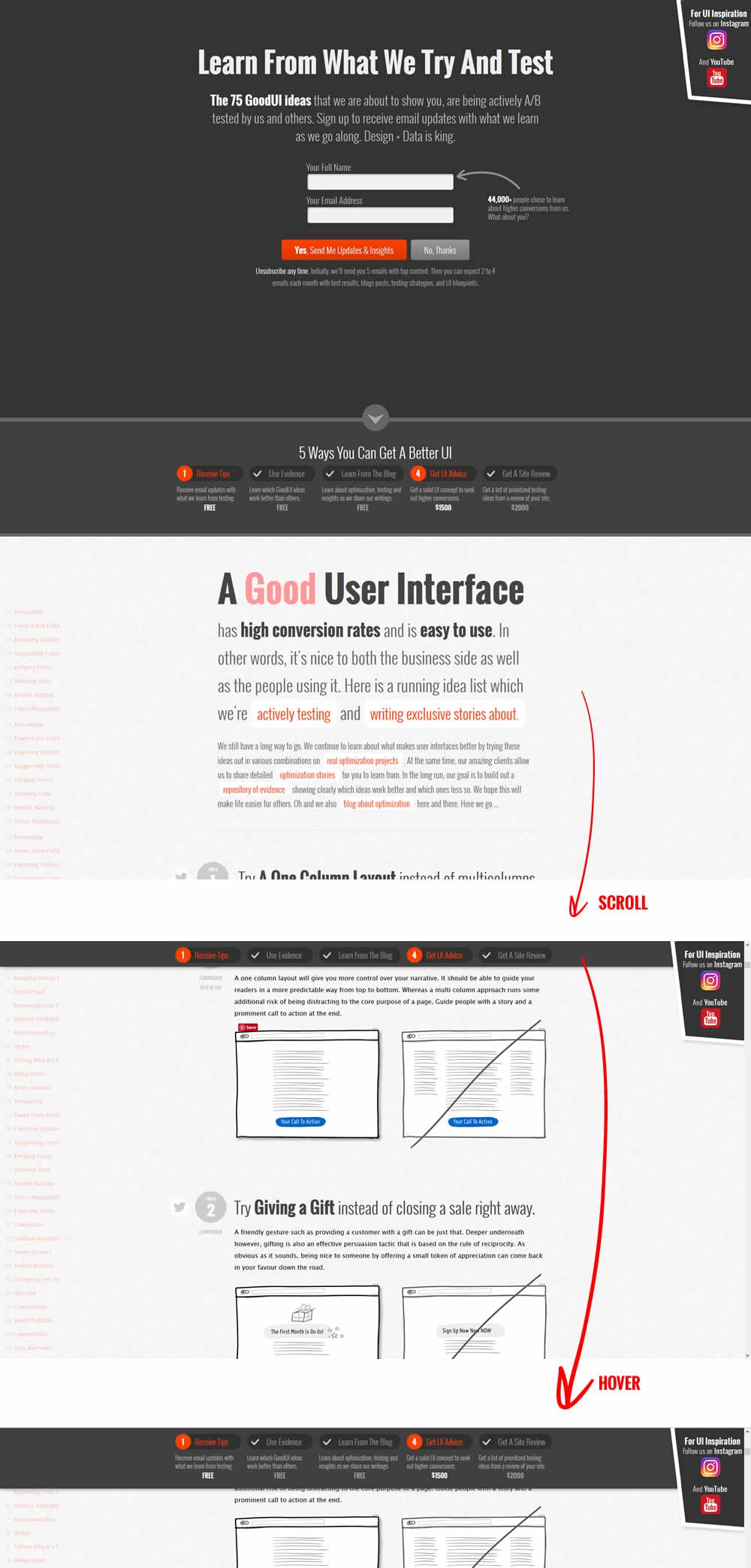
In this experiment, we showed a sticky navigation bar with 5 actions such as (newsletter signup, and visiting certain landing pages). Upon completion of each task, the navigation would transform into a completed state while using cookies to store it for future reference.

Get Access To See The Test Results

Test #134 Tested on Kenhub.com by Niels Hapke Niels Dec 14, 2017

Find Out How It Performed With 29,743 Visitors

Product
  • Measured by visits to pricing page   |   p-val (?)

  • Measured by premium sales   |   p-val (?)

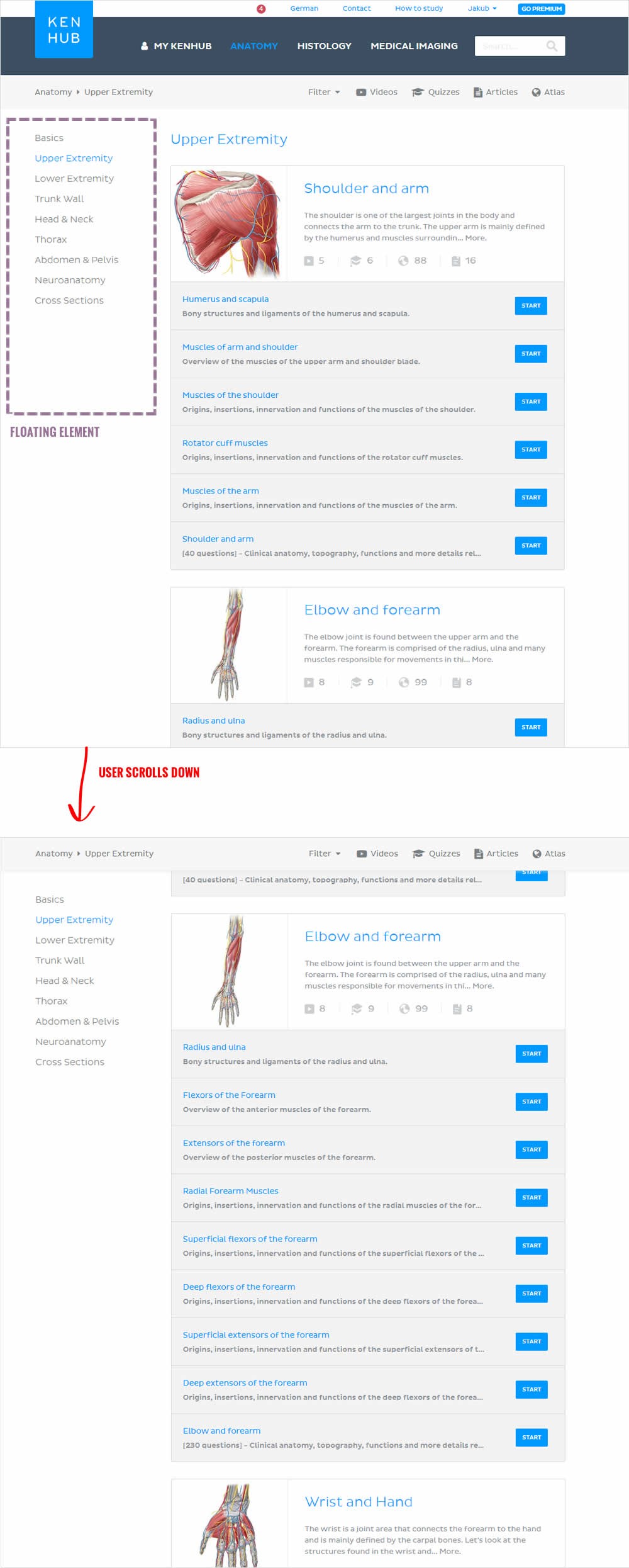
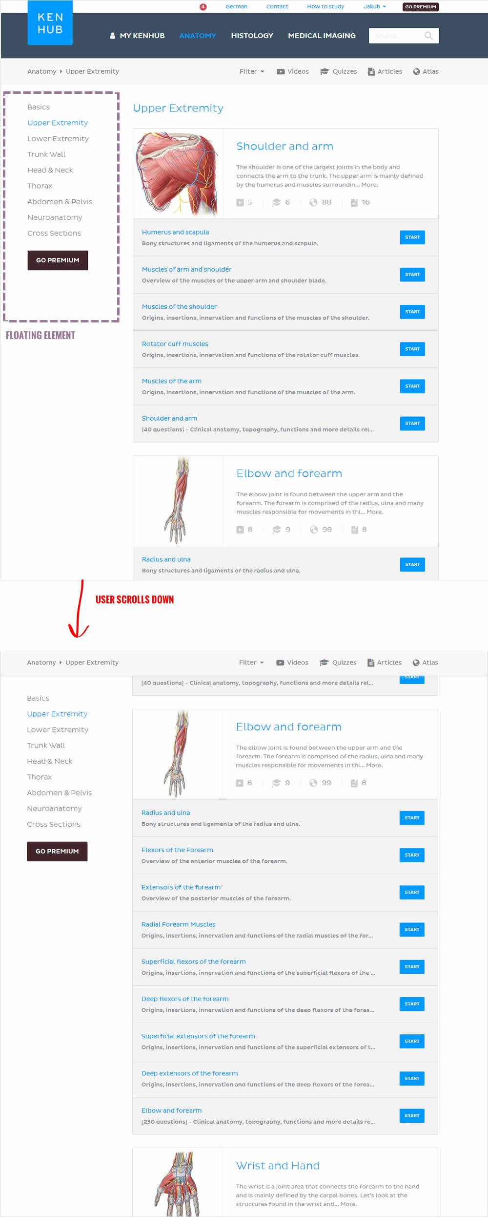
In this beautiful test, the key change was the introduction of a larger call to action linking to a premium / upgrade screen. The call to action was placed on the left sidebar which was floating. This is a great example of providing visibility to important elements by making them persistent.

Get Access To See The Test Results

Test #132 Tested on Sjvc.edu by Phillip Barnes Phillip Dec 12, 2017

Find Out How It Performed With 1,437 Visitors

Home & Landing Mobile
  • Measured by clicks on CTA to form   |   p-val (?)

  • Measured by lead form submissions   |   p-val (?)

In this test, a footer with a button to a lead form was turned into a floating one.

Get Access To See The Test Results

For each pattern, we measure three key data points derived from related tests:

REPEATABILITY - this is a measure of how often a given pattern has generated a positive or negative effect. The higher this number, the more likely the pattern will continue to repeat.

SHALLOW MEDIAN - this is a median effect measured with low intent actions such as initiating the first step of a lengthier process

DEEP MEDIAN - this is derived from the highest intent metrics that we have for a given test such as fully completed signups or sales.