Pattern #49: Above The Fold Call To Action Save Pattern Bookmark

Pattern Author: Daniel Shapiro - Co-Founder @ Designlab

Based on 7 Tests, Members See How Likely This Pattern Will Win Or Lose And Its (?) Median Effect
Almost Certain Loser
-5
-4
-3
-2
-1
0
+1
+2
+3
+4
+5
Almost Certain Winner
Above The Fold Call To Action
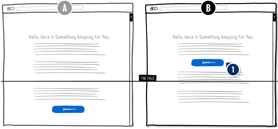
  1. Add: Visible Call To Action Repetition

    The pattern suggests to raise a call to action visibly above the fold. The idea is if a button is more visible, more people will act on it. The counter hypothesis is that by placing it earlier, some people might not be ready to act just yet. Perhaps positioning the call to action further down, generates more motivation to act.

Median Effects

?

Engagement

Ex: Any Action / Visit

(6 tests)

?

Conversions

Ex: Signups, Leads

(4 tests)

?

Sales

Ex: Transactions, Upsells

(3 tests)

?

Revenue

Ex: AOV, LTV

?

Retention

Ex: Return Visits

?

Referrals

Ex: Social Shares

Tests

Pattern #49: Above The Fold Call To Action
Was Tested On Examine.com by Martin Wong

Test #160 Tested on Examine.com by Martin Wong Martin Mar 15, 2018

Find Out How It Performed With 25,025 Visitors

Product Desktop, Mobile
  • Measured by checkout visits   |   p-val (?)

  • Measured by bundle and individual purchases   |   p-val (?)

Get Access To See The Test Results

The Same Pattern Was Also Tested Here

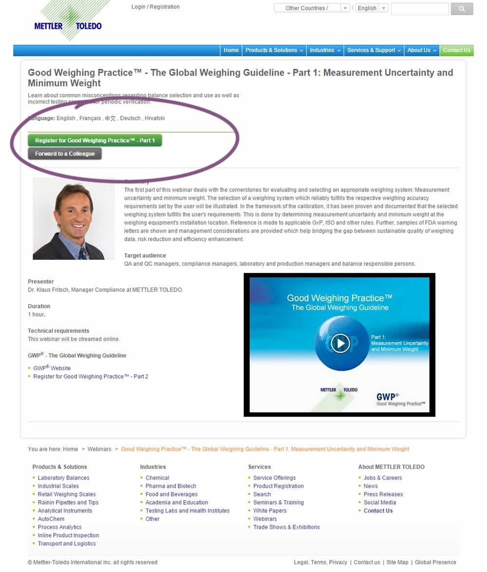
Test #244 Tested on Mt.com by Vito Mediavilla Vito Jun 06, 2019

Find Out How It Performed With 3,711 Visitors

Product Desktop
  • Measured by form fill starts   |   p-val (?)

  • Measured by successful registrations   |   p-val (?)

A product landing page with an image was tested against one without - raising the call to action above the fold.

Get Access To See The Test Results

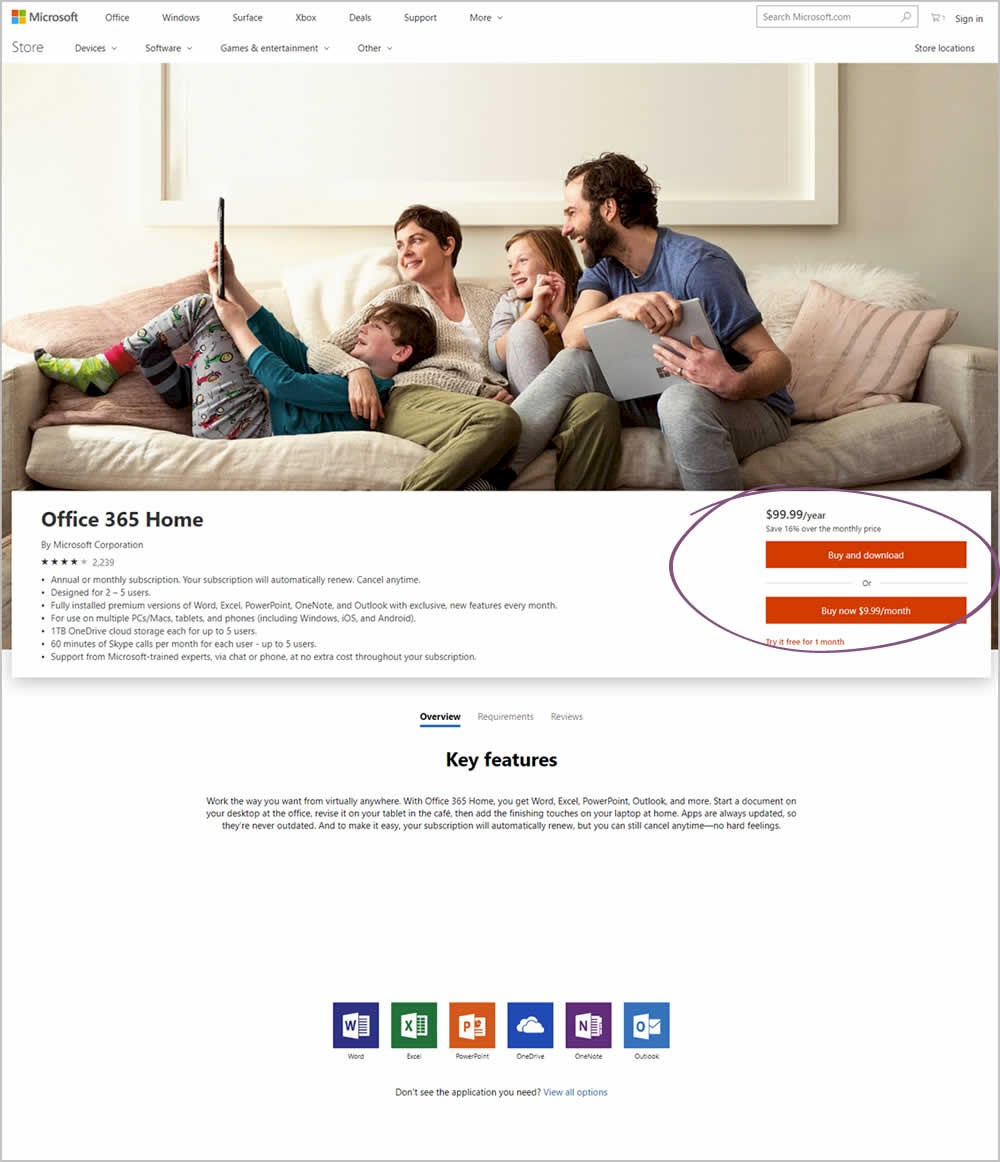
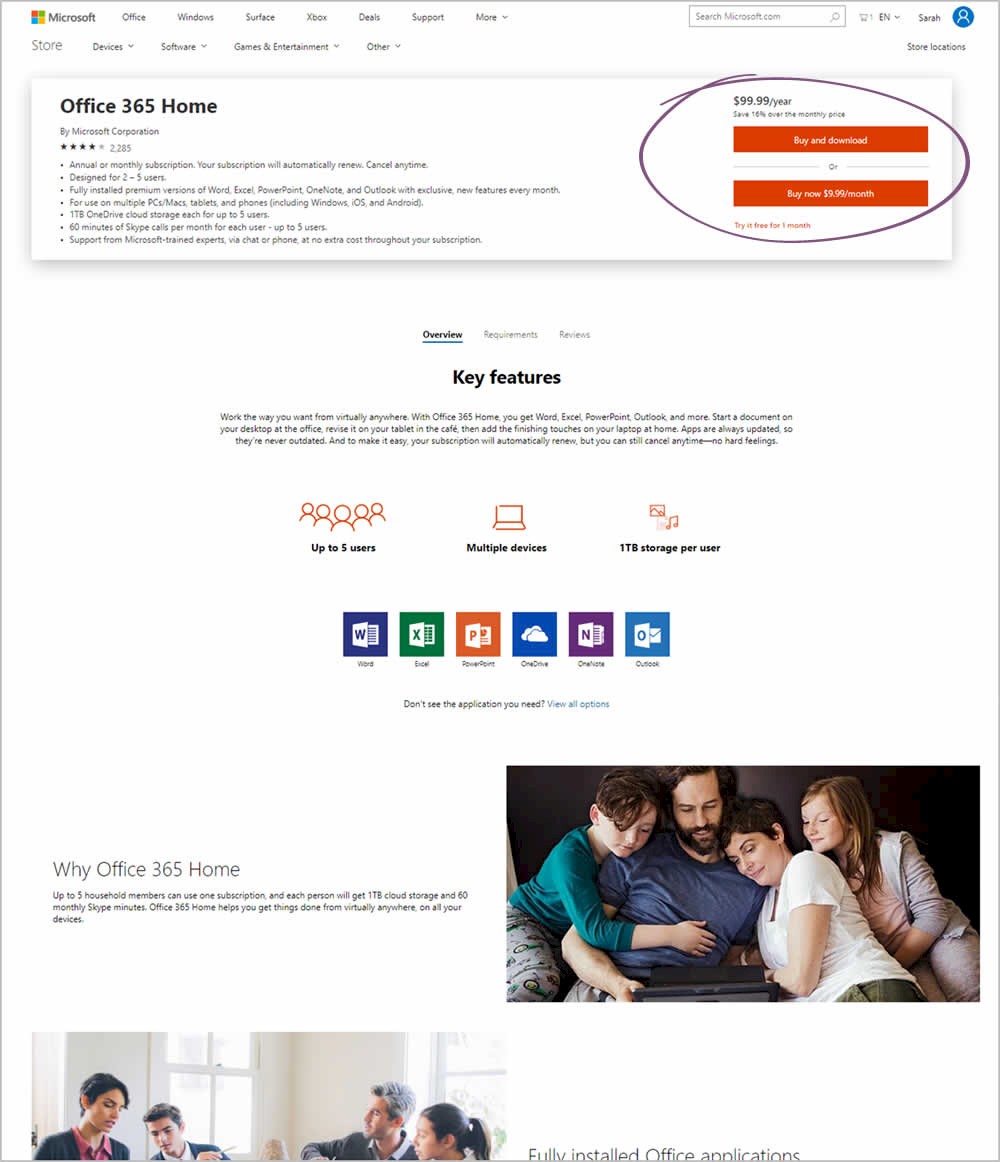
Test #221 Tested on Microsoft.com by Ronny Kohavi Ronny Jan 27, 2019

Find Out How It Performed

Product
  • Measured by users adding any product to cart   |   p-val (?)

  • Measured by total orders   |   p-val (?)

Microsoft Store ran an experiment on the Office 365 Home product page. The treatment raised the purchase calls to action higher by removing the hero image.

Get Access To See The Test Results

Test #185 Tested on Retrome.pl by Grzegorz Jancewicz Grzegorz Jul 03, 2018

Find Out How It Performed With 823 Visitors

Listing Mobile
  • Measured by visits to quote page   |   p-val (?)

  • Measured by successful quote submissions   |   p-val (?)

Get Access To See The Test Results

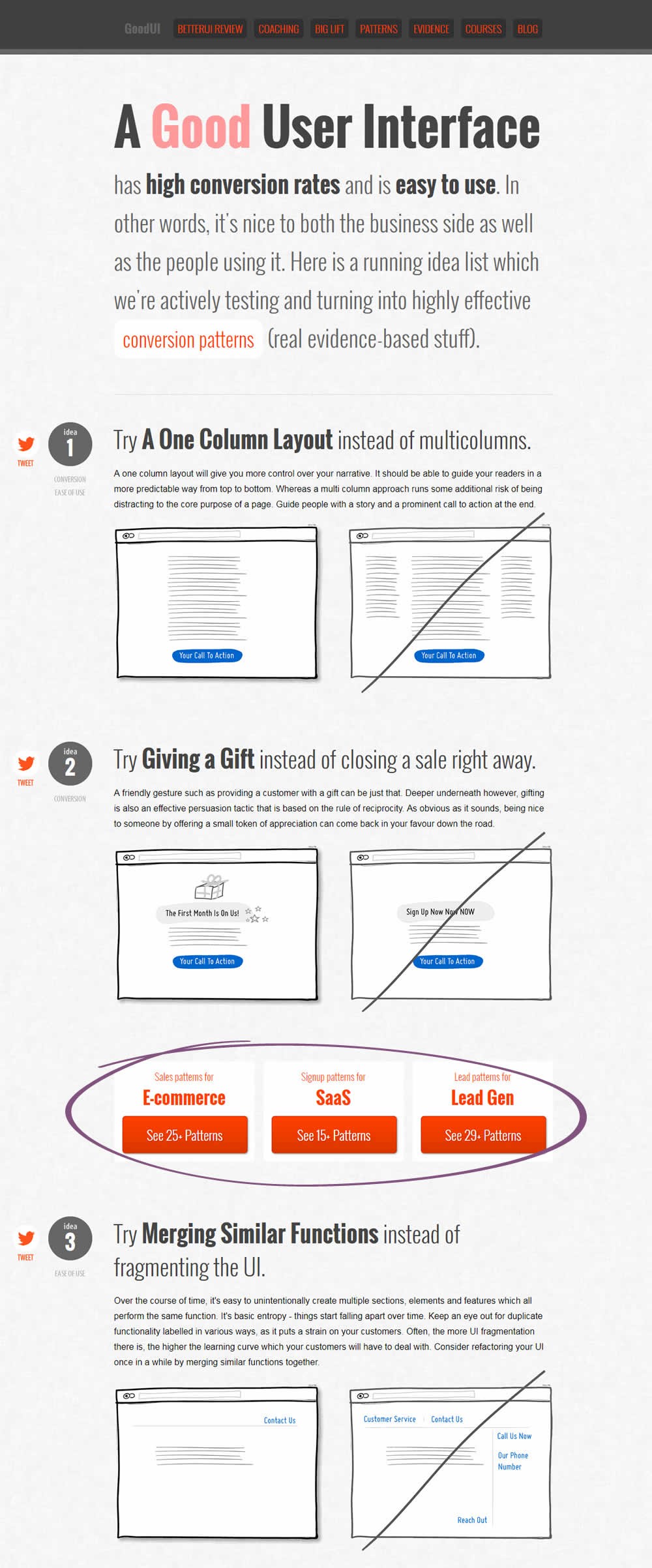
Test #170 Tested on Goodui.org by Jakub Linowski Jakub Apr 24, 2018

Find Out How It Performed With 11,616 Visitors

Home & Landing Desktop, Mobile
  • Measured by visits on any 3 links to search results   |   p-val (?)

  • Measured by adds to cart   |   p-val (?)

Get Access To See The Test Results

Test #146 Tested on Goodui.org by Jakub Linowski Jakub Jan 25, 2018

Find Out How It Performed With 1,090 Visitors

Home & Landing Desktop, Mobile
  • Measured by focus on form field   |   p-val (?)

  • Measured by form submits   |   p-val (?)

Get Access To See The Test Results

Test #141 Tested on Trydesignlab.com by Daniel Shapiro Daniel Jan 05, 2018

Find Out How It Performed With 5,789 Visitors

Product
  •  

  • Measured by form submits   |   p-val (?)

The variation introduced a call to action at the top of the screen that linked to a form deep down on a long course page.

Get Access To See The Test Results

For each pattern, we measure three key data points derived from related tests:

REPEATABILITY - this is a measure of how often a given pattern has generated a positive or negative effect. The higher this number, the more likely the pattern will continue to repeat.

SHALLOW MEDIAN - this is a median effect measured with low intent actions such as initiating the first step of a lengthier process

DEEP MEDIAN - this is derived from the highest intent metrics that we have for a given test such as fully completed signups or sales.