Pattern #59: Inverted Or Consistent Button Styles Save Pattern Bookmark
Pattern Author:
 Nicholas Evans
- Director of UX @ Reverb
Based on 1 Tests, Members See How Likely This Pattern Will Win Or Lose And Its (?) Median Effect

-
Consistent Button Styles Consistency
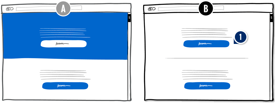
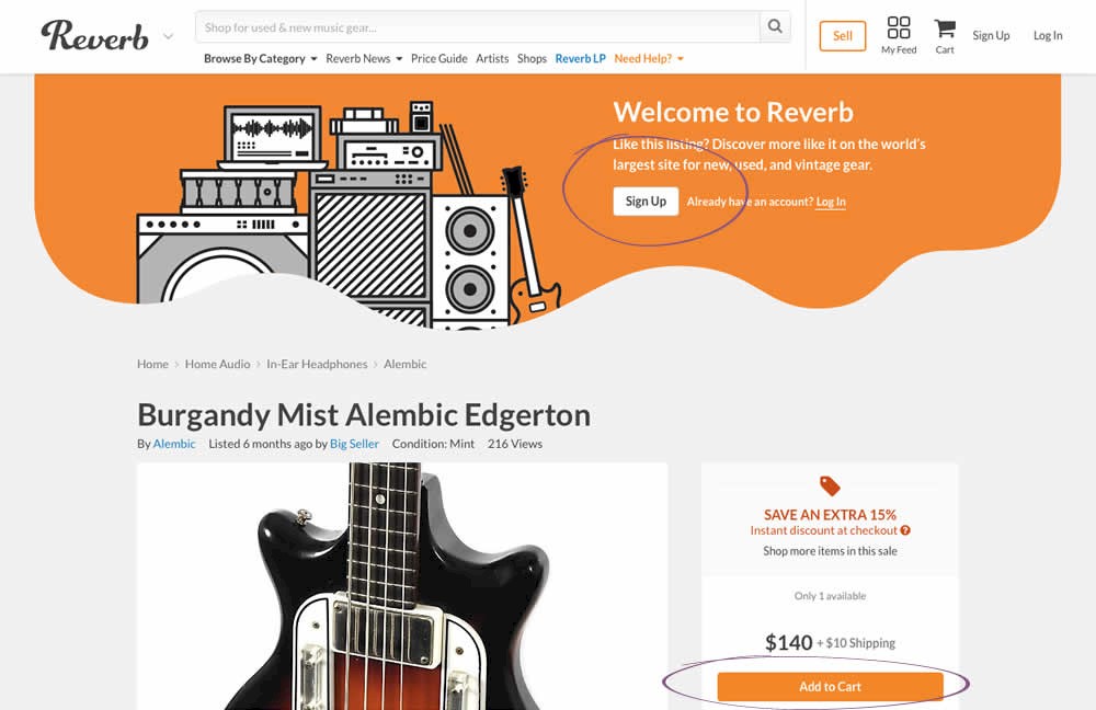
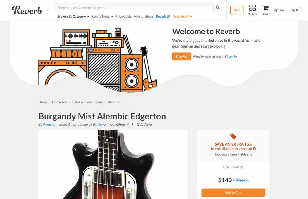
The pattern suggests to use consistent button styles instead of mixed or inverted styles. A consistent button style looks the same across a complete page. Alternatively, a mixed use button style breaks away from this convention. For example, the A version on the left has inverted colors bringing more attention to the background itself than the button.
Median Effects
?
Engagement
Ex: Any Action / Visit
?
Conversions
Ex: Signups, Leads
(1 tests)
?
Sales
Ex: Transactions, Upsells
?
Revenue
Ex: AOV, LTV
?
Retention
Ex: Return Visits
?
Referrals
Ex: Social Shares
For each pattern, we measure three key data points derived from related tests:
REPEATABILITY - this is a measure of how often a given pattern has generated a positive or negative effect. The higher this number, the more likely the pattern will continue to repeat.
SHALLOW MEDIAN - this is a median effect measured with low intent actions such as initiating the first step of a lengthier process
DEEP MEDIAN - this is derived from the highest intent metrics that we have for a given test such as fully completed signups or sales.


