Pattern #9: Multiple Steps Save Pattern Bookmark

Pattern Author: Jakub Linowski - Founder & Editor @ GoodUI.org

Based on 6 Tests, Members See How Likely This Pattern Will Win Or Lose And Its (?) Median Effect
Almost Certain Loser
-5
-4
-3
-2
-1
0
+1
+2
+3
+4
+5
Almost Certain Winner
Multiple Steps
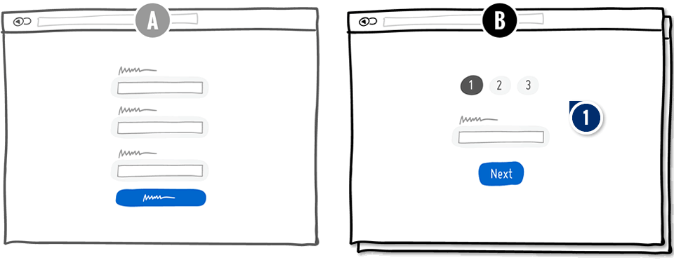
  1. Add: More Steps Smaller Commitments

    This pattern suggests to break one bigger task into a set of smaller steps. It may be easier to feel accomplishment this way as smaller tasks are completed more quickly.

Median Effects

?

Engagement

Ex: Any Action / Visit

(1 tests)

?

Conversions

Ex: Signups, Leads

(4 tests)

?

Sales

Ex: Transactions, Upsells

(1 tests)

?

Revenue

Ex: AOV, LTV

(1 tests)

?

Retention

Ex: Return Visits

?

Referrals

Ex: Social Shares

Tests

Pattern #9: Multiple Steps
Was Tested by Alex James

Test #236 Tested on An Anonymous Site Apr 04, 2019

Find Out How It Performed With 282,316 Visitors

Signup Desktop
  •  

  • Measured by successful registrations   |   p-val (?)

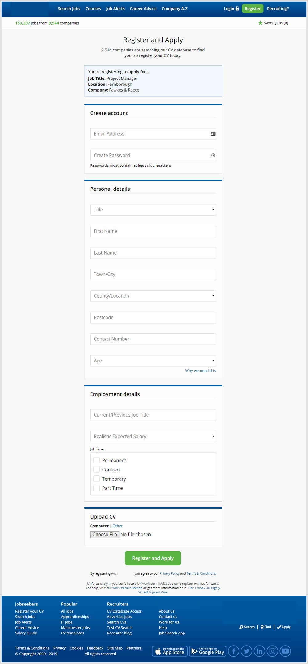
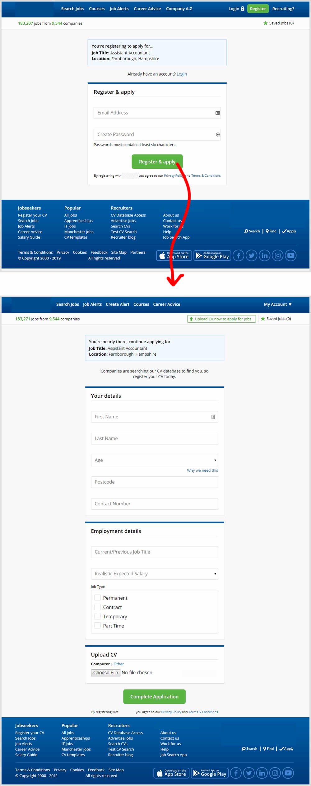
In this experiment a single screen signup process was broken into 2 separate steps: account creation & details.

Get Access To See The Test Results

The Same Pattern Was Also Tested Here

Test #273 Tested on Elevate App by Jesse Germinario Jesse Dec 19, 2019

Find Out How It Performed With 152,381 Visitors

Signup Mobile
  •  

  • Measured by 14 day trial starts (delayed payment)   |   p-val (?)

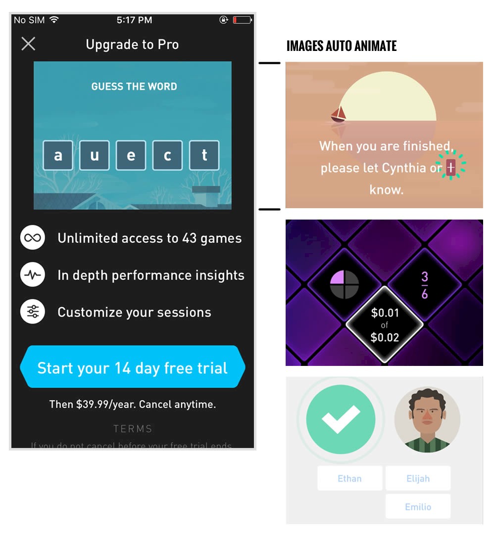
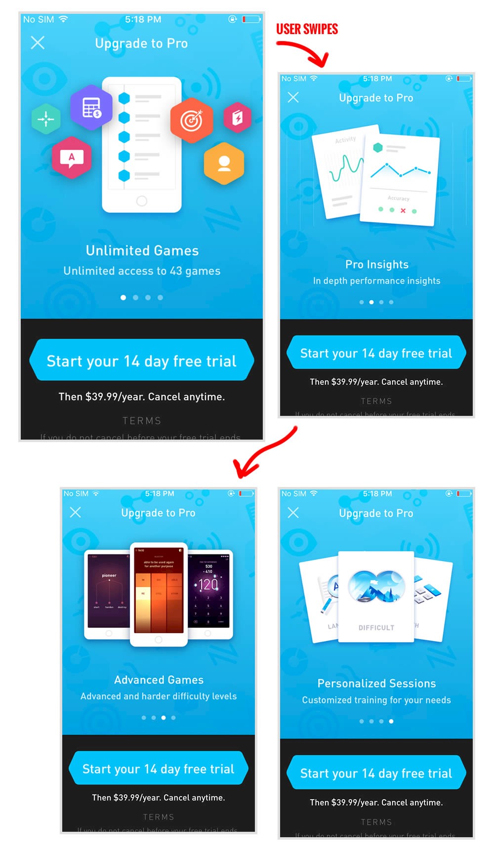
This experiment tests the impact of a different paywall screen on iOS. The current control paywall screen for 100% of iOS users was the animated pro screen. In this screen, users see an animation that gives shows glimpses of several Elevate games in action, as well as a bulleted list of key selling points for Pro. The proposed change (variant B) features a swipeable carousel of pages where each page has an image and some accompanying text explaining a different benefit of subscribing to Pro. The hypothesis is that we can lift conversion by showing users the alternate swiping paywall screen.

Get Access To See The Test Results

Test #91 Tested on 3dhubs.com by Rob Draaijer Rob Jan 01, 2017

Find Out How It Performed With 54,916 Visitors

Listing
  • Measured by quote process starts   |   p-val (?)

  • Measured by successful quote orders placed   |   p-val (?)

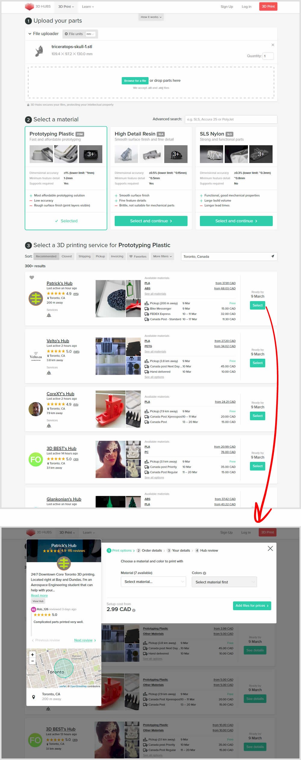
In this experiment, a long form with multiple steps was broken down into a progressive interaction form. In the B variant, as users would complete particular steps, new ones would be communicated subtly and finally come into full view.

Get Access To See The Test Results

Test #66 Tested on Telestream.net by Chris Goward Chris Nov 01, 2016

Find Out How It Performed With 7,610 Visitors

Shopping Cart
  •  

  • Measured by visits to post-payment   |   p-val (?)

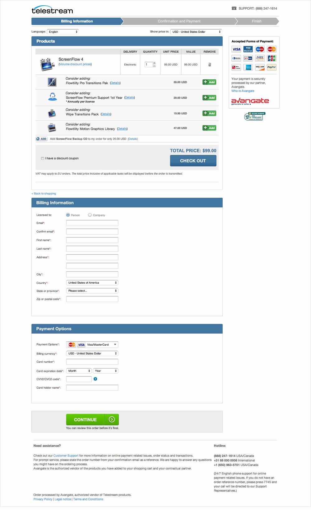
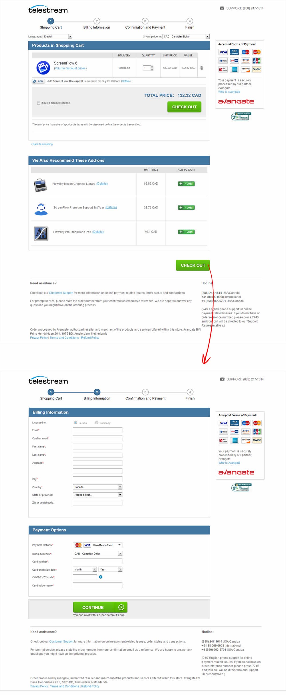
Telestream specializes in software that make it possible to get video content to any audience regardless of how it is created, distributed, or viewed. Telestream’s customer acquisition strategy is centered around driving traffic to their website to trial, or to purchase from their online store. Shoppers can buy software online, download it right away, and immediately start using it. The variation was designed with the same information as the control except spread across 4 steps (instead of 3). The rationale was that each step would be shorter and less overwhelming for the user.

Get Access To See The Test Results

Test #1 Tested on An Anonymous Site May 01, 2015

Find Out How It Performed With 18,081 Visitors

Product
  •  

  • Measured by visits to final thank you page   |   p-val (?)

Get Access To See The Test Results

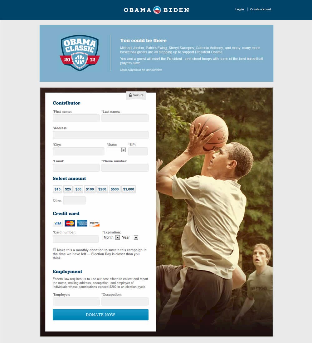
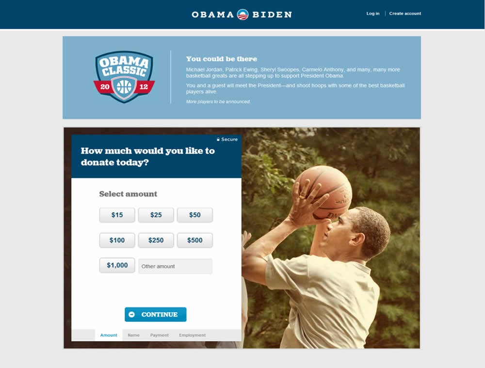
Test #129 Tested on Barackobama.com by Kyle Rush Jun 01, 2012

Maybe It Worked Here

Checkout

Source: kylerush.net/blog/optimization-at-the-obama-campaign-ab-testing/

Kyle's team changed a donation form for the Barack Obama 2012 campaign from a single step to a 4 step one. The 4 steps were: amount, personal information, billing information and occupation/employer.

"Our plan was to separate the field groups into four smaller steps so that users did not feel overwhelmed by the length of the form." - Kyle Rush

For each pattern, we measure three key data points derived from related tests:

REPEATABILITY - this is a measure of how often a given pattern has generated a positive or negative effect. The higher this number, the more likely the pattern will continue to repeat.

SHALLOW MEDIAN - this is a median effect measured with low intent actions such as initiating the first step of a lengthier process

DEEP MEDIAN - this is derived from the highest intent metrics that we have for a given test such as fully completed signups or sales.